pacman::p_load(tidyverse, ggplot2, gganimate, plotly, ggiraph, DT)Take-Home_Ex03: Be Weatherwise or Otherwise
1 Overview
According to an office report as shown in the infographic below,
Daily mean temperature are projected to increase by 1.4 to 4.6, and
The contrast between the wet months (November to January) and dry month (February and June to September) is likely to be more pronounced.
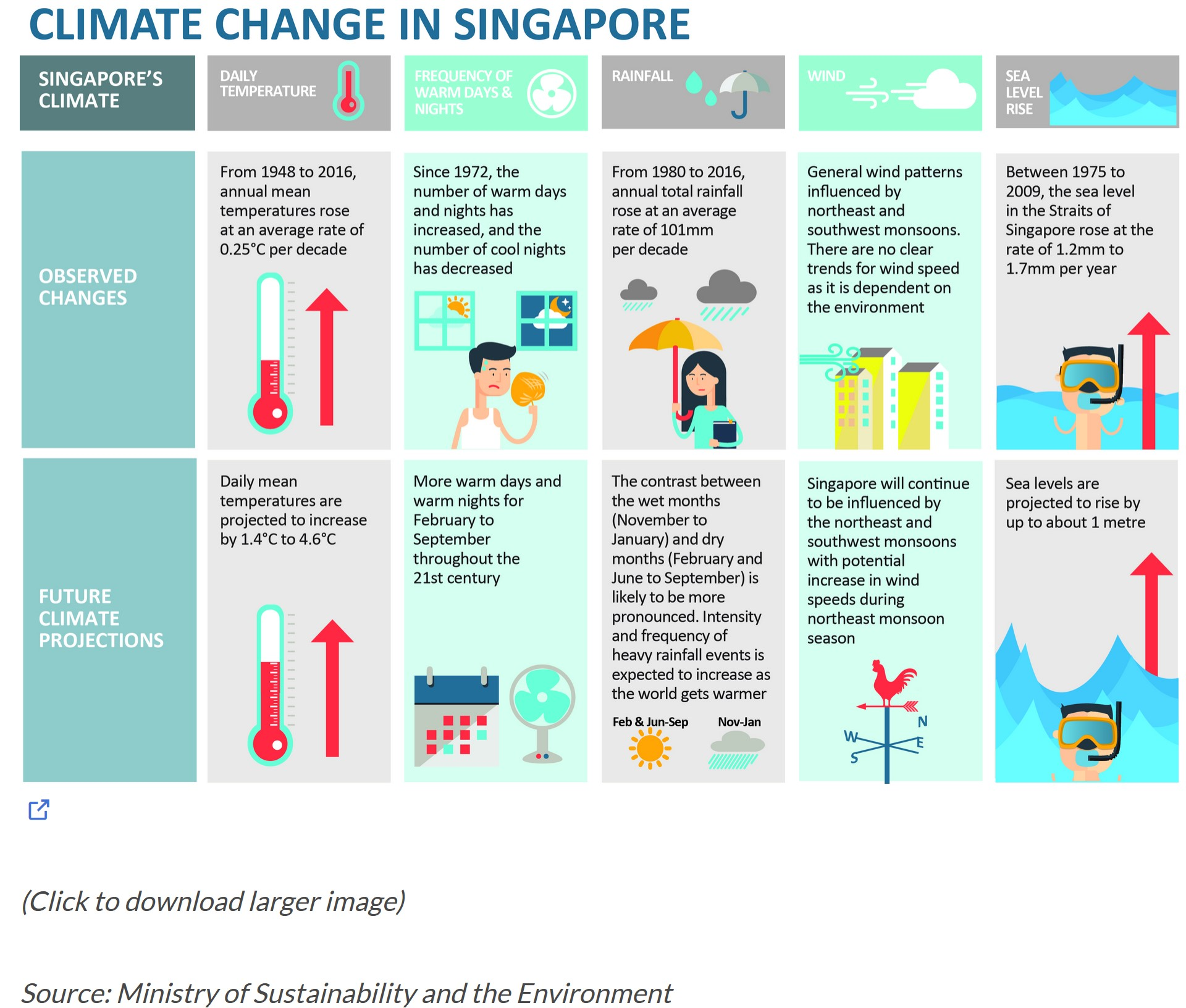
In this take home exercise, we will apply newly acquired visual interactivity and visualising uncertainty methods to validate the claims presented above
2 Data Preparation
2.1 Loading R Packages
In this take home exercise, the following R packages will be used:
The code chunk used is as follows:
2.2 Importing Temperature Data
Changi will be selected for the weather station, and temperature chosen as the factor to be analysed. The data sets will be downloaded from historical daily temperature from Meteorological Service Singapore website, Specifically, we will be looking from the years 1983, 1993, 2003, 2013, and 2023, with May as the specific month of study.
temp1983 <- read_csv("data/DAILYDATA_S24_198305.csv", locale=locale(encoding="latin1"))

temp1983 <- temp1983 %>%
  select(Year, Month, Day,
         `Mean Temperature (°C)`,
         `Maximum Temperature (°C)`,
         `Minimum Temperature (°C)`)
temp1993 <- read_csv("data/DAILYDATA_S24_199305.csv", locale=locale(encoding="latin1"))
temp1993 <- temp1993 %>%
select(Year, Month, Day,
`Mean Temperature (°C)`,
`Maximum Temperature (°C)`,
`Minimum Temperature (°C)`)temp2003 <- read_csv("data/DAILYDATA_S24_200305.csv", locale=locale(encoding="latin1"))
temp2003 <- temp2003 %>%
select(Year, Month, Day,
`Mean Temperature (°C)`,
`Maximum Temperature (°C)`,
`Minimum Temperature (°C)`)temp2013 <- read_csv("data/DAILYDATA_S24_201305.csv", locale=locale(encoding="latin1"))
temp2013 <- temp2013 %>%
select(Year, Month, Day,
`Mean Temperature (°C)`,
`Maximum Temperature (°C)`,
`Minimum Temperature (°C)`)temp2023 <- read_csv("data/DAILYDATA_S24_202305.csv", locale=locale(encoding="latin1"))
temp2023 <- temp2023 %>%
select(Year, Month, Day,
`Mean Temperature (°C)`,
`Maximum Temperature (°C)`,
`Minimum Temperature (°C)`
)
colnames(temp2023)[colnames(temp2023) == 'Maximum Temperature (°C)'] <- 'Maximum Temperature (°C)'
colnames(temp2023)[colnames(temp2023) == 'Mean Temperature (°C)'] <- 'Mean Temperature (°C)'
colnames(temp2023)[colnames(temp2023) == 'Minimum Temperature (°C)'] <- 'Minimum Temperature (°C)'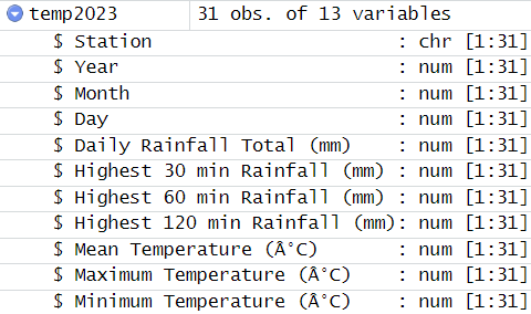
Note
Unlike the dataset extracted for the earlier years, the column names for the temperatures in May 2023 were coded with an additional “”. To align the naming nomenclauture across the different datsets, colnames from base R was used to remove the “”.
Lastly, using the code chunk below, we will combine the five datasets into a single document, and save it as a new dataset.
combinedTemp <- bind_rows(temp1983,temp1993,temp2003,temp2013,temp2023)

write_rds(combinedTemp, "data/combinedTemp.csv")
Next, we will call the dataset “combinedTemp” into the environment.
combinedTemp <- read_rds("data/combinedTemp.csv")2.3 Summary Statistics of Data
Using DT, we will display the dataset as a interactive table on html page.
DT::datatable(combinedTemp, class = "display compact", style = "bootstrap5")
Note
The data table seemed to be in order.
str(combinedTemp)tibble [155 × 6] (S3: tbl_df/tbl/data.frame)
$ Year : num [1:155] 1983 1983 1983 1983 1983 ...
$ Month : num [1:155] 5 5 5 5 5 5 5 5 5 5 ...
$ Day : num [1:155] 1 2 3 4 5 6 7 8 9 10 ...
$ Mean Temperature (°C) : num [1:155] 27.5 28.3 28.9 28.1 28.2 27.9 28.2 27.3 26.2 28.1 ...
$ Maximum Temperature (°C): num [1:155] 32.2 33.1 33.5 33.4 32.7 32.8 33.1 34 32.2 32.9 ...
$ Minimum Temperature (°C): num [1:155] 24.3 25 26 25 25.3 25.2 24.9 23.5 23.7 24.7 ...
Note
The data types are all correct.
Checking for missing values
sum(is.na(combinedTemp))[1] 0
Note
No missing values were found.
3 Static Data Visualisation
ggplot() +
  geom_line(data=combinedTemp,
            aes(x=Day,
                y=`Mean Temperature (°C)`,
                group=Year),
            colour="black") +

  geom_line(data=combinedTemp,
            aes(x=Day,
                y=`Maximum Temperature (°C)`,
                group=Year),
            colour="red") +

  geom_line(data=combinedTemp,
            aes(x=Day,
                y=`Minimum Temperature (°C)`,
                group=Year),
            colour="green") +

  geom_smooth(data=combinedTemp,
            aes(x=Day,
                y=`Mean Temperature (°C)`,
                group=Year),
            colour="black", linewidth = 0.2) +

  geom_smooth(data=combinedTemp,
            aes(x=Day,
                y=`Maximum Temperature (°C)`,
                group=Year),
            colour="red", linewidth = 0.2) +

  geom_smooth(data=combinedTemp,
            aes(x=Day,
                y=`Minimum Temperature (°C)`,
                group=Year),
            colour="green", linewidth = 0.2) +

  facet_grid(~Year) +
  labs(axis.text.x = element_blank(),
       title = "Daily Temperature in Changi during May",
       subtitle = "(Max, Mean, Min Temperature)") +
  xlab("Day") +
  ylab("Temperature (°C)") +

  theme(plot.subtitle = element_text(size = 5, color = "grey"))
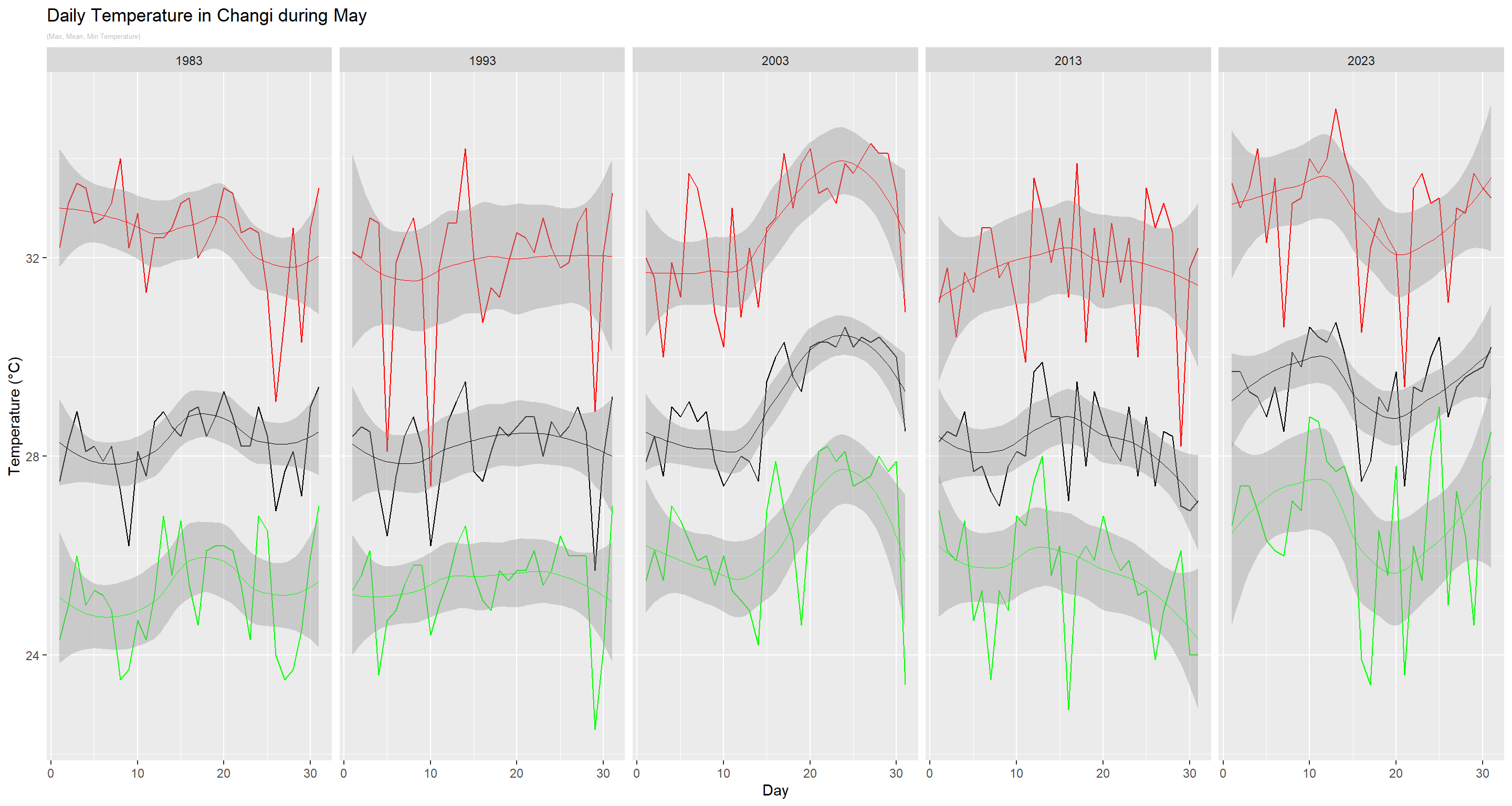
Note
In the static plot above, a comparison of the temperatures across the five years was made, with the red, black and green charts depicting the maximum, mean and minimum temperatures per day respectively.
A common observation within each year is that there is a high volatility in the temperature within a month, regardless whether it is measuring the max, mean or min temperatures. In addition, when the max temperature is higher than the rest of the days, the mean and minimum temperatures are also usually higher.
When we plot using a curve, we observed that from 1983 to 1993, there appeared to be a decrease in daily temperatures, before it started to increase in 2003. It then decreased in 2013, before peaking in 2023 again. The highest temperature is also recorded in 2023.
4 Interactive Data Visualisation
d <- highlight_key(combinedTemp)

p1 <- ggplot() +
  geom_point(data = d,
             aes(x = Day,
                 y = `Minimum Temperature (°C)`),
             group = "Year",
             colour = "green",
             size = 0.5) +
  geom_smooth(data=combinedTemp,
              aes(x=Day,
                  y=`Minimum Temperature (°C)`,
                  group=Year),
              colour="green", linewidth = 1) +
  facet_grid(~Year)

p2 <- ggplot() +
  geom_point(data = d,
             aes(x = Day,
                 y = `Mean Temperature (°C)`),
             group = "Year",
             colour = "black",
             size = 0.5) +
  facet_grid(~Year) +
  geom_smooth(data=d,
              aes(x=Day,
                  y=`Mean Temperature (°C)`,
                  group="Year"),
              colour="black", linewidth = 1)

p3 <- ggplot() +
  geom_point(data = d,
             aes(x = Day,
                 y = `Maximum Temperature (°C)`),
             group = "Year",
             colour = "red",
             size = 0.5) +
  facet_grid(~Year) +
  geom_smooth(data=combinedTemp,
              aes(x=Day,
                  y=`Maximum Temperature (°C)`,
                  group=Year),
              colour="red", linewidth = 1) +
  ggtitle("Daily Temperature in Changi during May")

subplot(ggplotly(p3),
        ggplotly(p2),
        ggplotly(p1), nrows = 3)
Note
The interactive plot above allows us to find out the exact readings for each of the daily temperatures captured in May from 1983 to 2023. When we select any reading in any chart, the corresponding readings in the other two charts will be highlighted as well.
ggplot(combinedTemp, aes(x = Day, y = `Mean Temperature (°C)`,
                      size = `Mean Temperature (°C)`,
                      colour = as.factor(Year))) +

  geom_point(aes(size = scale(`Mean Temperature (°C)`)),
             alpha = 2, show.legend = FALSE) +

  geom_text(aes(label = Year, hjust = -0.5, size = 5), show.legend = FALSE) +

  scale_colour_manual(values = c("1983" = "lightskyblue",
                                  "1993" = "lightskyblue1",
                                  "2003" = "lightskyblue2",
                                  "2013" = "lightskyblue3",
                                  "2023" = "lightskyblue4")) +

  scale_size(range = c(2, 12)) +

  labs(title = 'Daily Mean Temperature across Different Days in May (1983 to 2023)',
       x = 'Day',
       y = '`Mean Temperature (°C)`') +

  transition_time(Day) +

  ease_aes(y = 'linear')
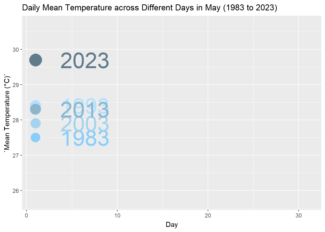
Note
From the animated plot above, we can see that the mean temperatures across the different years changes based on the days of the month. There is no clear indication that a particular day in May of a year is constantly hotter than its corresponding day of another year.
5 Conclusion
Based on the observations taken in Changi, the maximum, mean and minimum temperatures fluctuates across the different Month-May from 1983 to 2023. As 2023 recorded the peak mean temperature of 30.7°C, we can state that there is an overall increasing trend in the temperature.
However, if we compare the mean temperatures from 2003 to 2013, we also noted a decreasing trend in the mean temperature. Moreover, the average monthly mean temperature do not increase by more than 2°C on a decade-on-decade basis.
Thus, the data is not conclusive for the report to predict that mean temperatures will increase by 1.4°C to 4.6°C.