In-Class_Ex07a: Visualising and Analysing Geographic Data with Tableau
1 Introduction
In this in-class exercise, we will learn how to use Tableau to create visualise and analyse geographical date with Tableau and publish them on Tableau Public.
You can access the published Tableau site here.
2 Importing Data
Select all the files, and drag them into the table pane
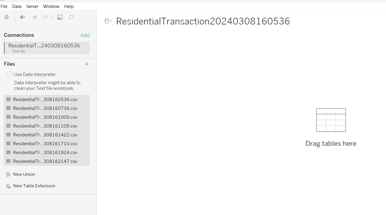
Alternatively, we can also drag file by file. Take note to drag the subsequent files onto the preceding file, and that the “union” textbox appears.
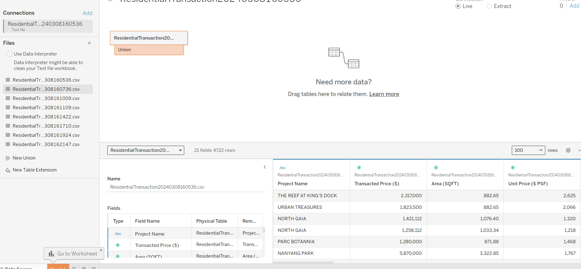
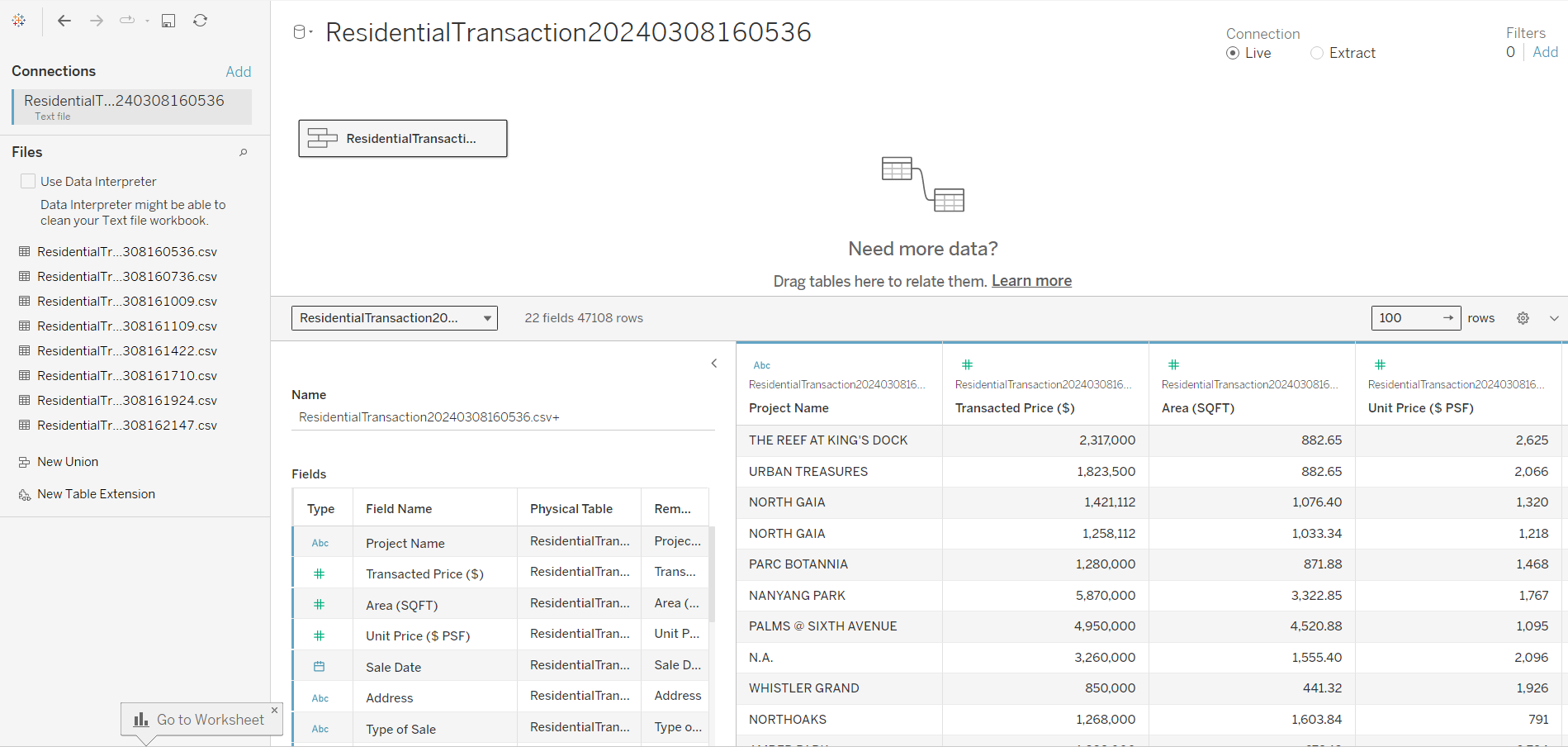
The resulting output is as follows. The eight spreadsheets have been joined into a single data source
3 Viewing the Data
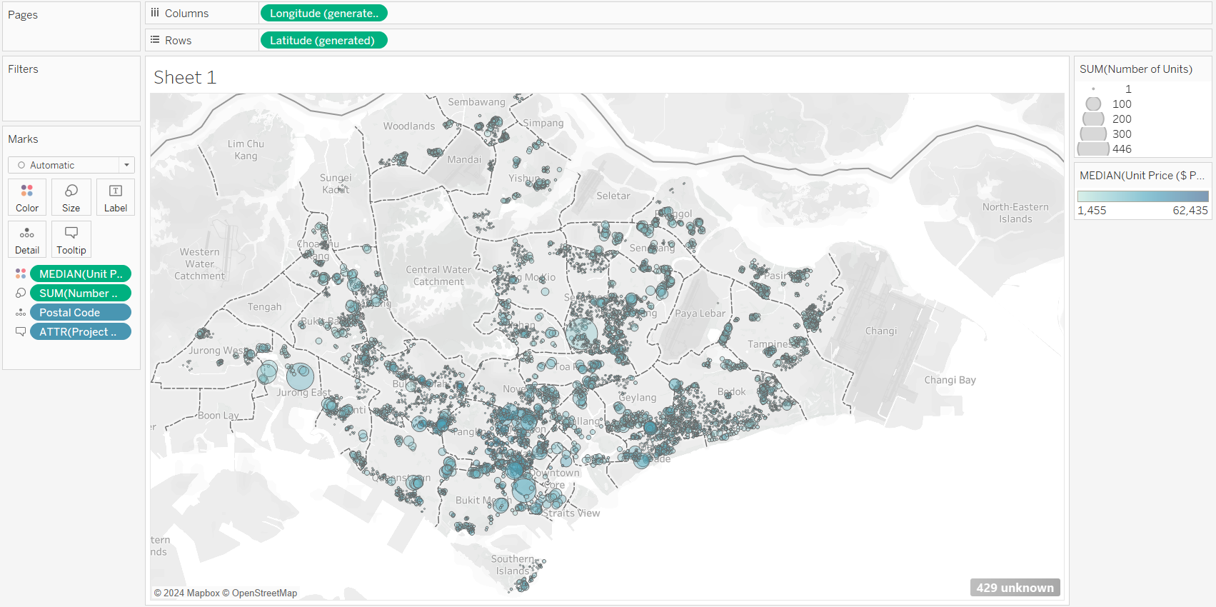
Drag the postal code into the sheet.
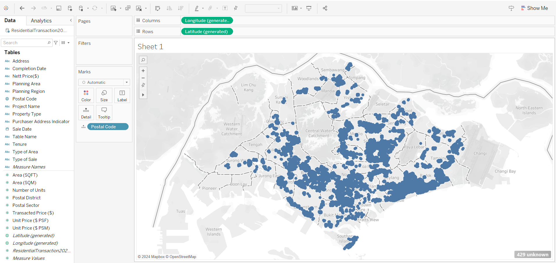
Note that the SG map is automatically loaded in Tableau. This is only possible when there is internet connection, as Tableau API reads the postal code, and links up with URA website to pull the base map.
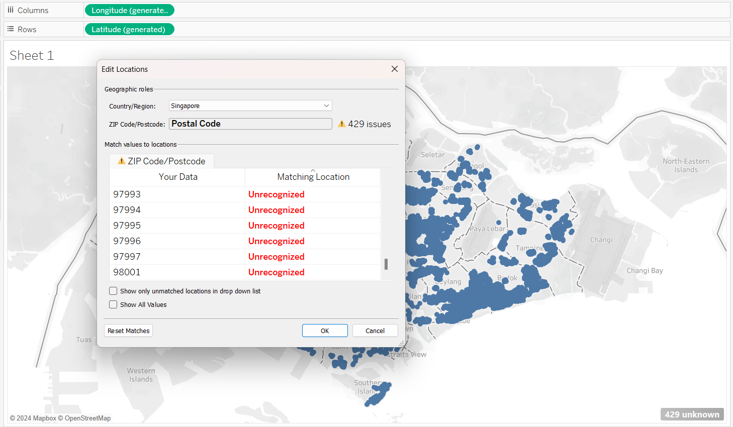
From the output above, we noticed that there are 429 unknown locations. These are locations that are currently under construction, and URA intentionally mask these from the map.
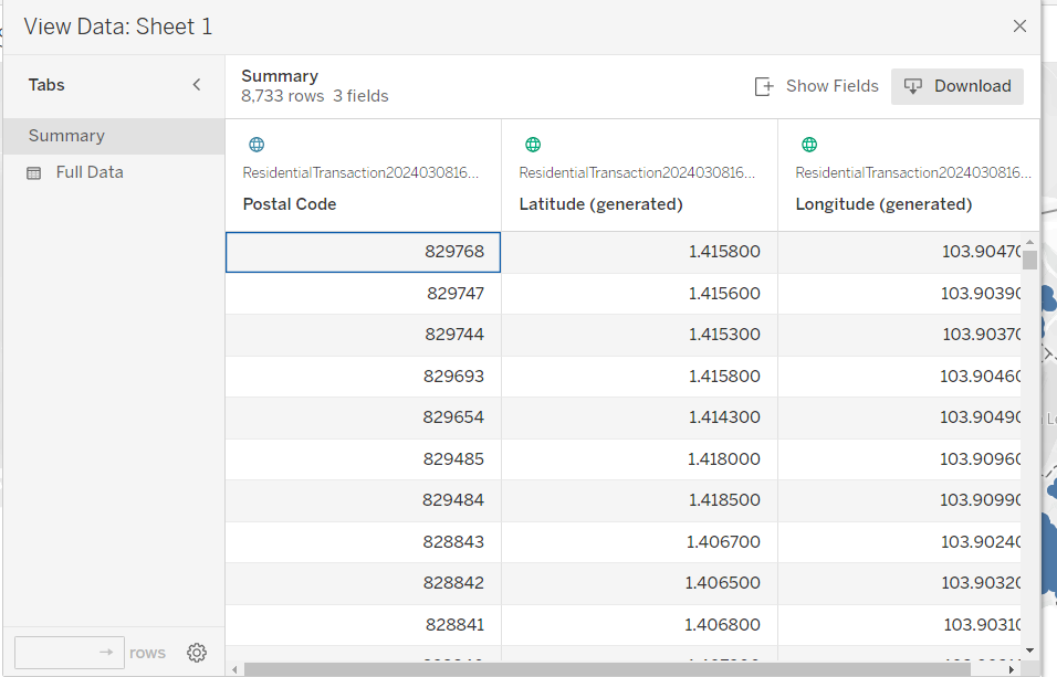
Using Tableau, we can also extract the lat and long from the postal code in the file, by right-clicking and choosing ” View data”.
4 Visualizing the Geographical Data
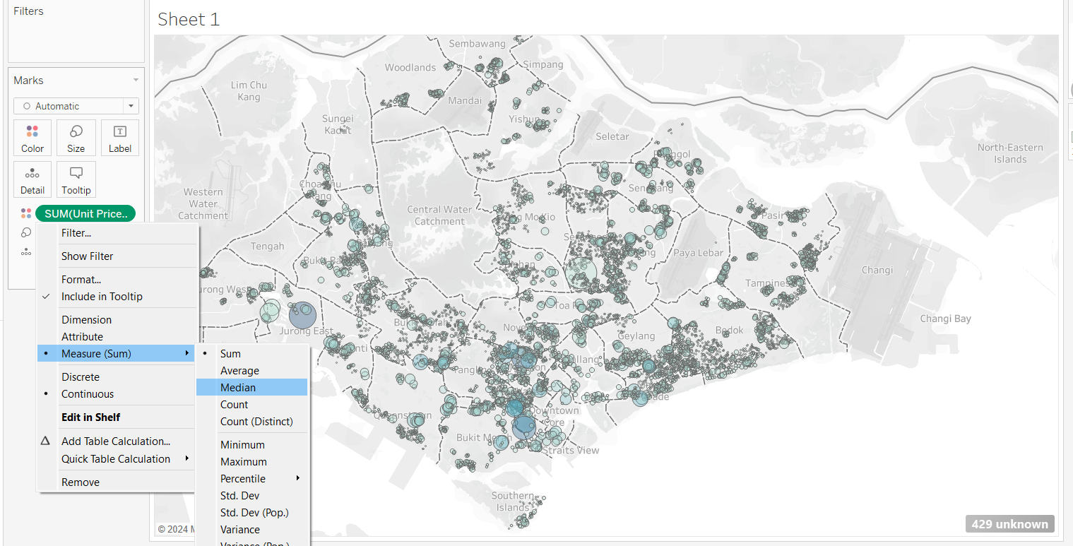
Drag and drop number of units to “Size”, and Unit Price to “Color”. Use Median(Price) instead of SUM(Price)
Drag Project Name into “Tooltip”
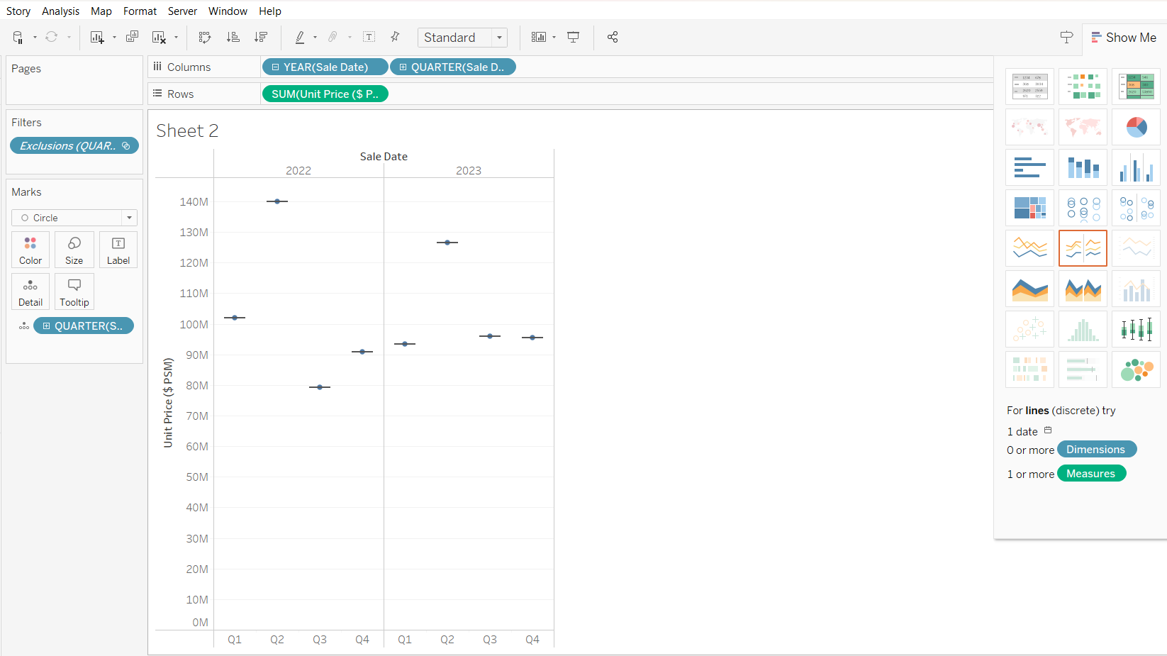
Next, we want to create the boxplot:
drag Sales Date to Column, and select year
Drag Sales Date (again) to column, and select quarter
drag unit price to Rows
select boxplot from the “Show Me”
Exclude leftmost data
adjust the size of the output
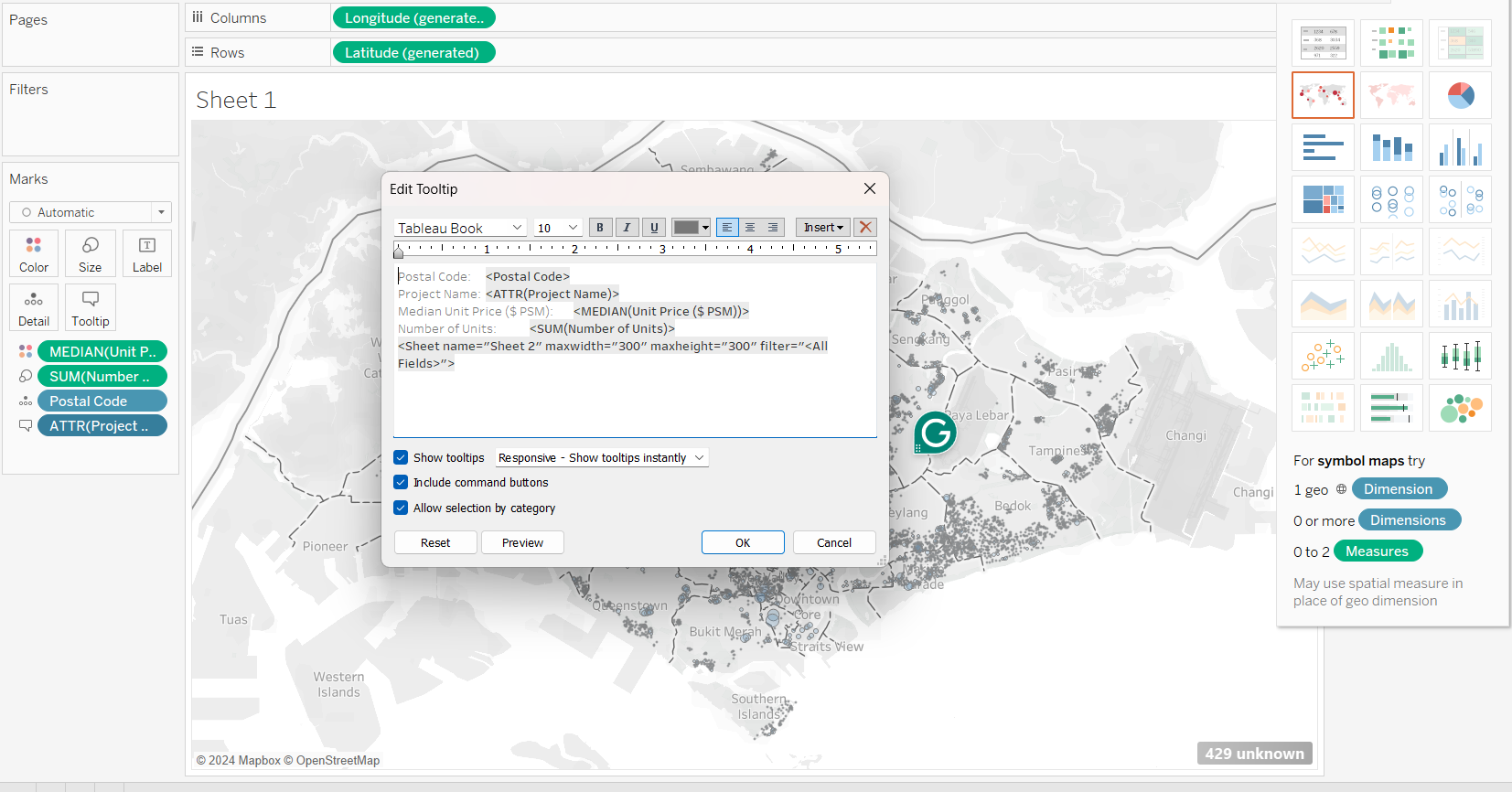
now, we connect Sheet 1 with Sheet 2, by editing the tooltip
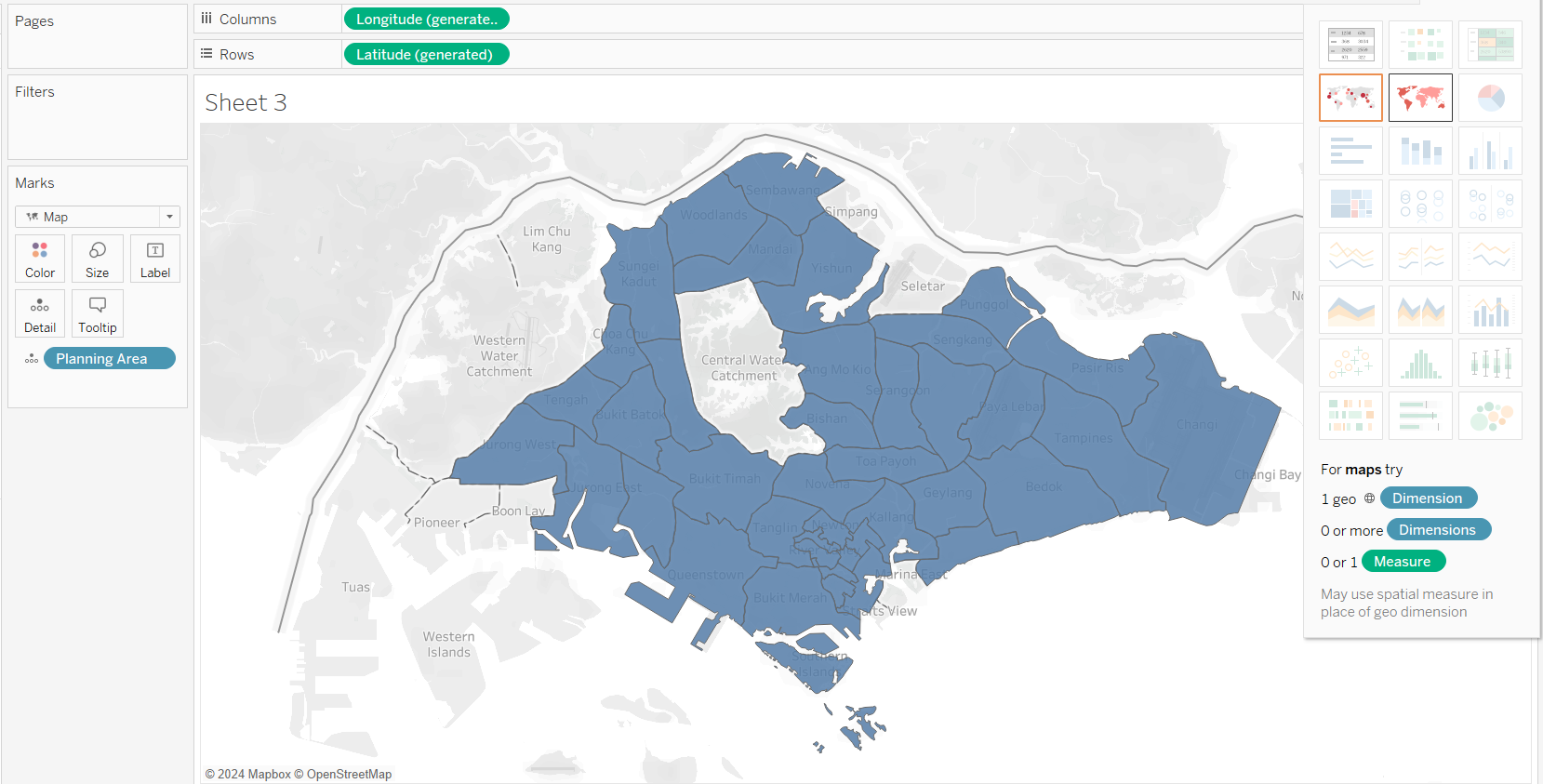
Next, we will create a new sheet. Let’s change the Planning Area’s Geographic role to “State/Province”.
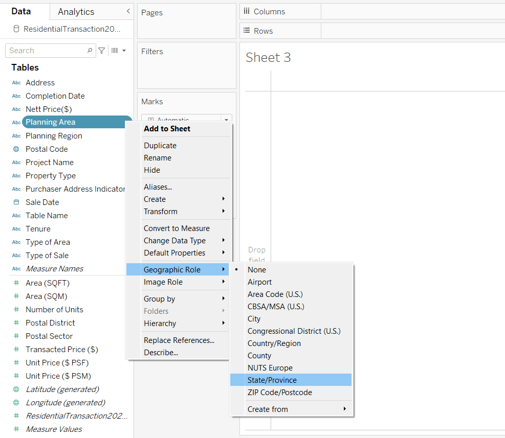
Comparing between the other geographic roles, “State/Province” gives the best fit.
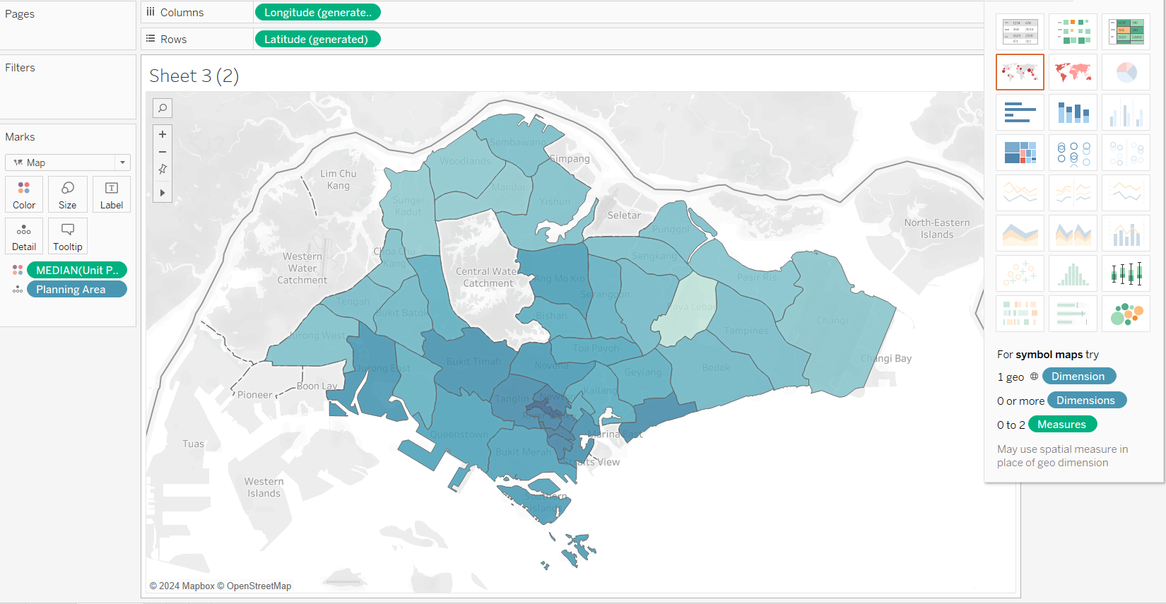
We will now duplicate the sheet, and replace planning area with median (unit price)
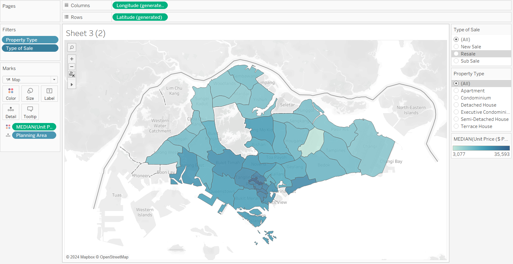
We will also add filters based on: (1) type of sale and (2) property type
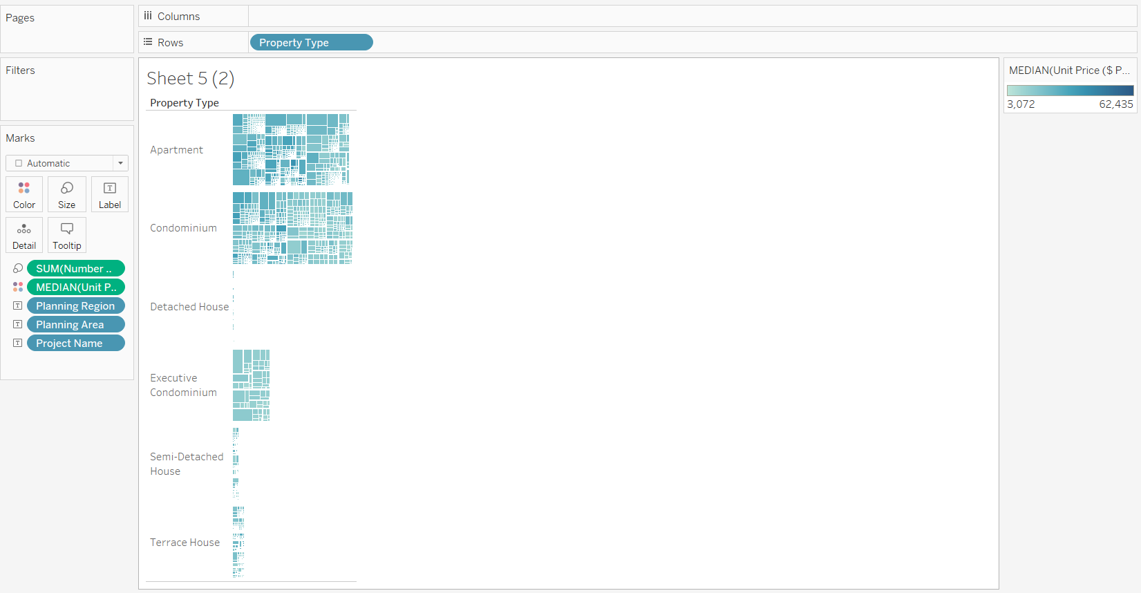
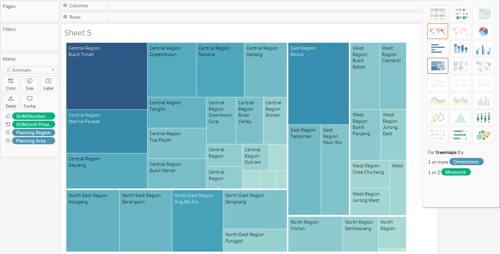
Next, we will plot a treemap. We will select:(1) planning area, (2) planning region, (3) median(unit price) and (4) sum(number of units) into the sheet, and select “Treemap” from “Show Me”.
We will also add project name to labels, and adding filter based on property type
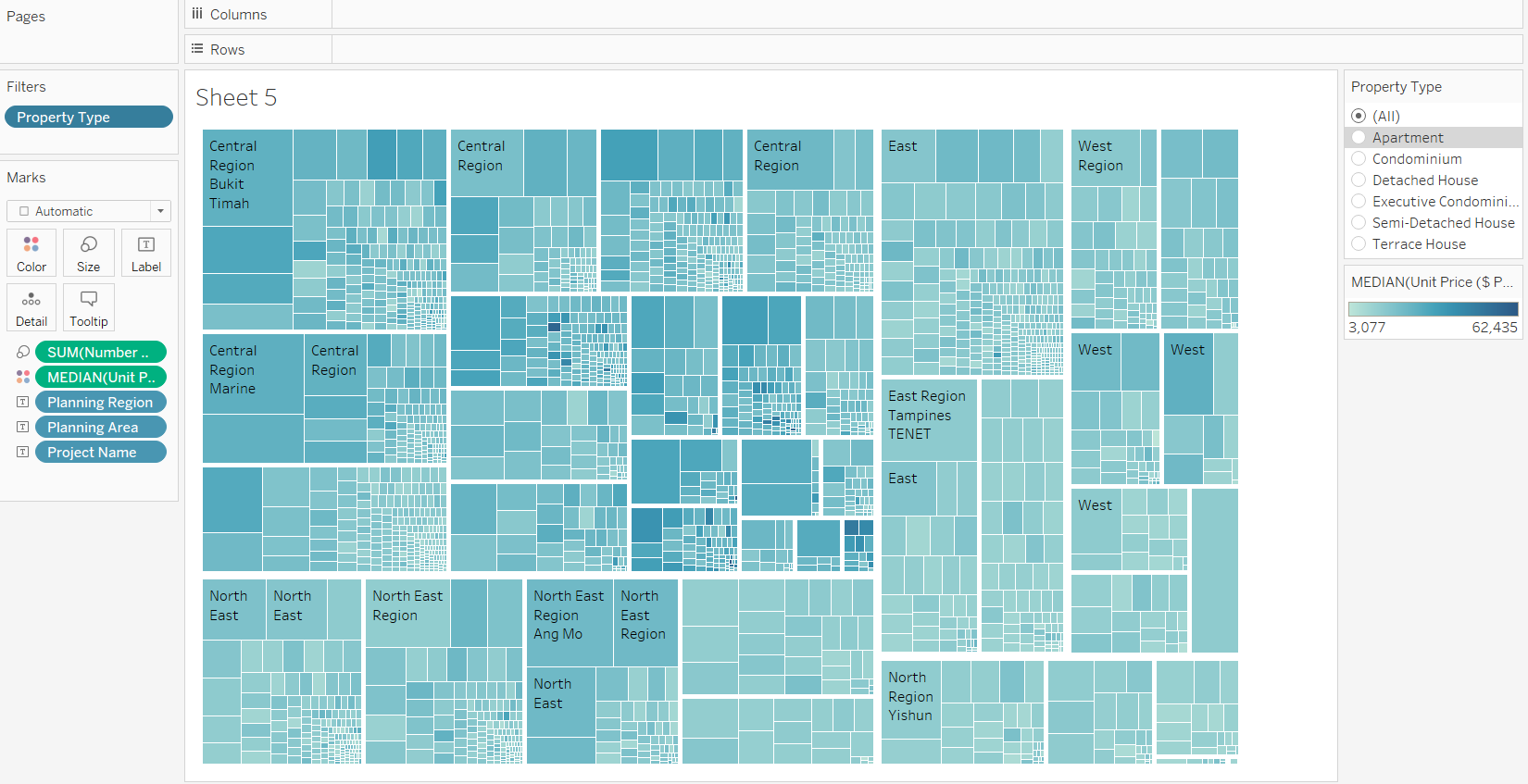
We can also organise treemaps by property type