In-Class Exercise 3: Tableau Visualisation
Refining-in-Progress: Dashboards and Story Points
1 Learning Outcome
In this in-class exercise, we will learn how to use Tableau Public to create interactive scatterplots. You can access the Superstore tableau report here and story here; and the Exam-data dashboard here.
2 Getting Started
2.1 Importing Data
We will build on what we have created during In-Class Exercise 2 here.
3 Using Tableau Functions
3.1 Creating a Scatter Plot
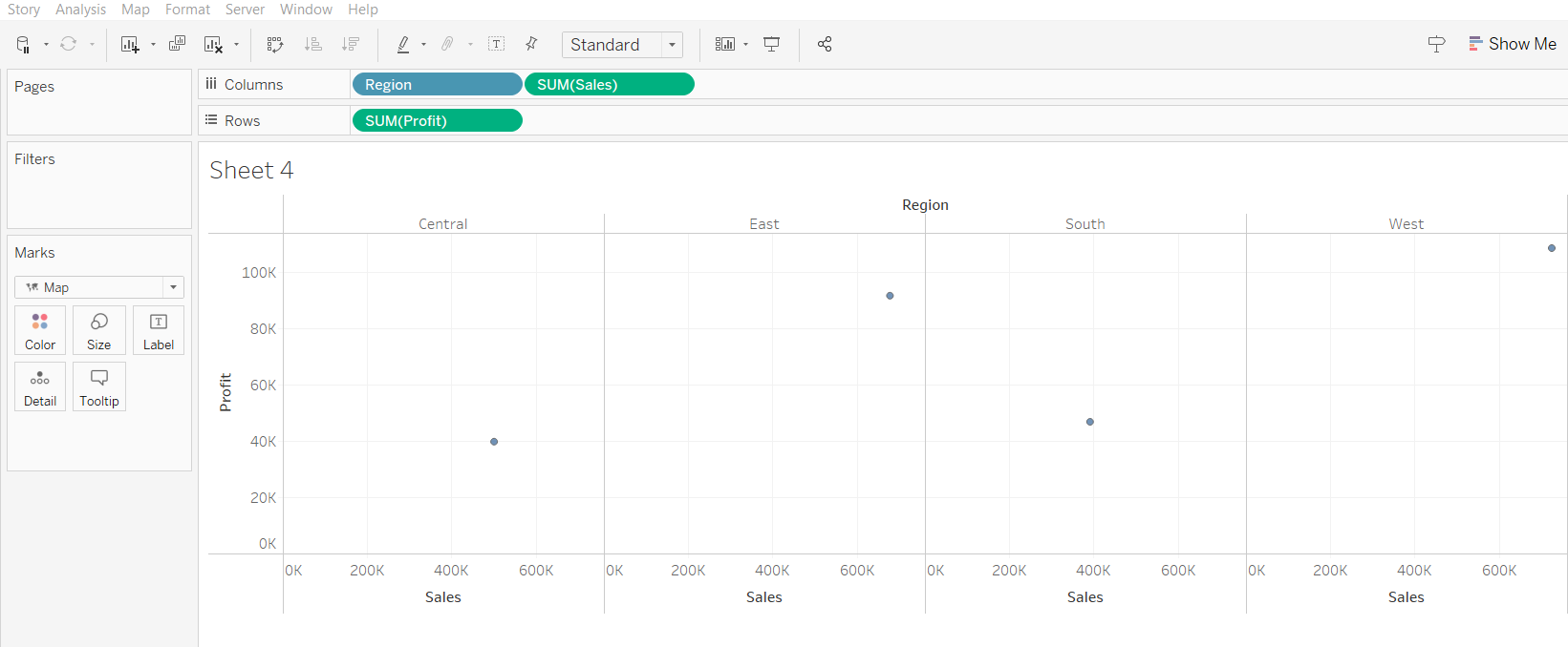
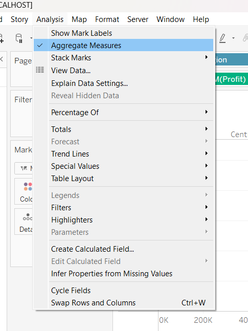
At first glance, the data points have been automatically aggregated. From Analysis tab, uncheck “Aggregate Measures” to reveal the scatter plot.
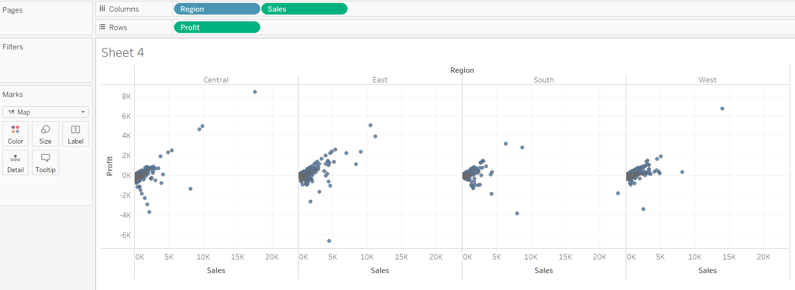
This is the resulting scatter plot.
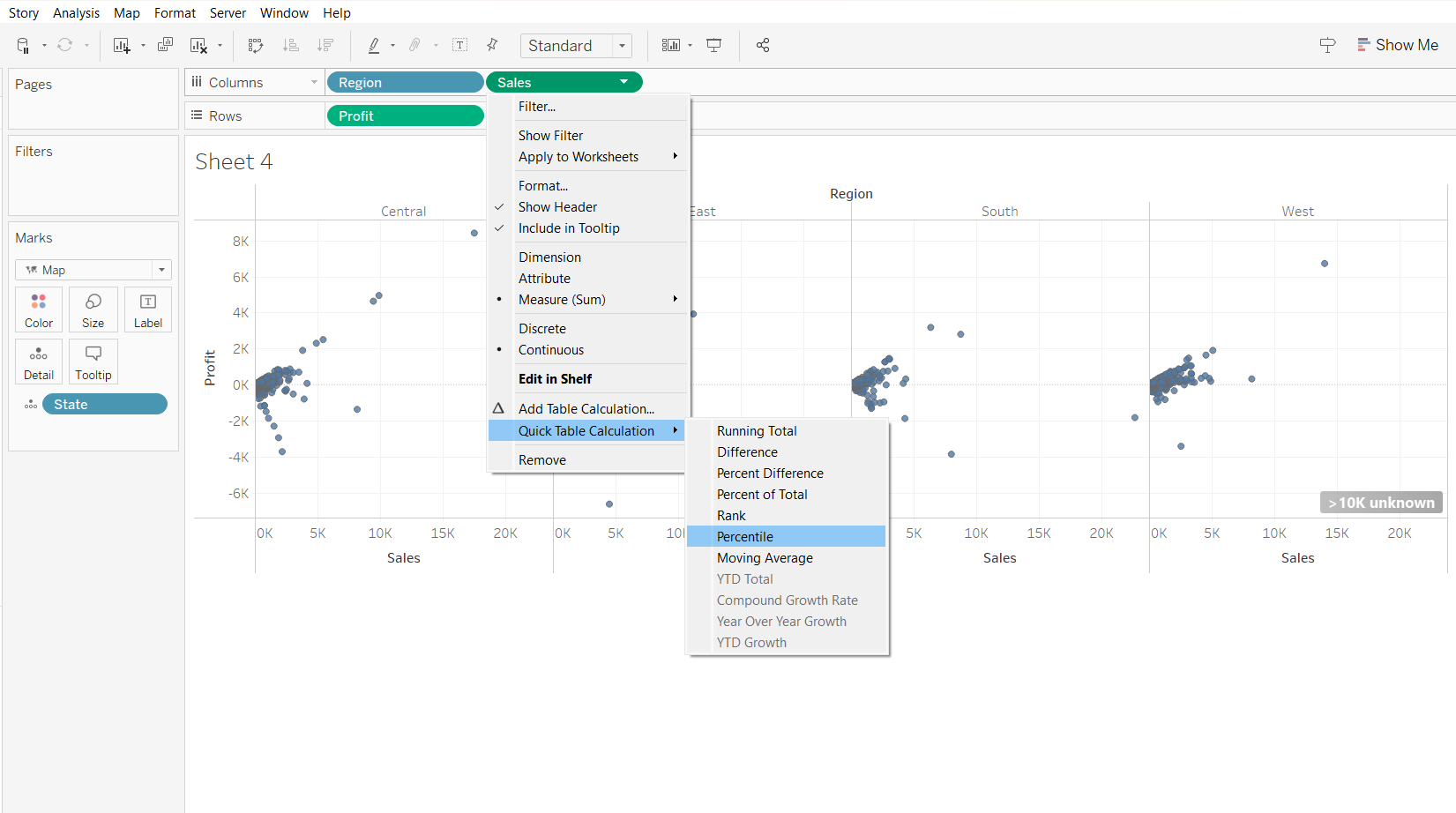
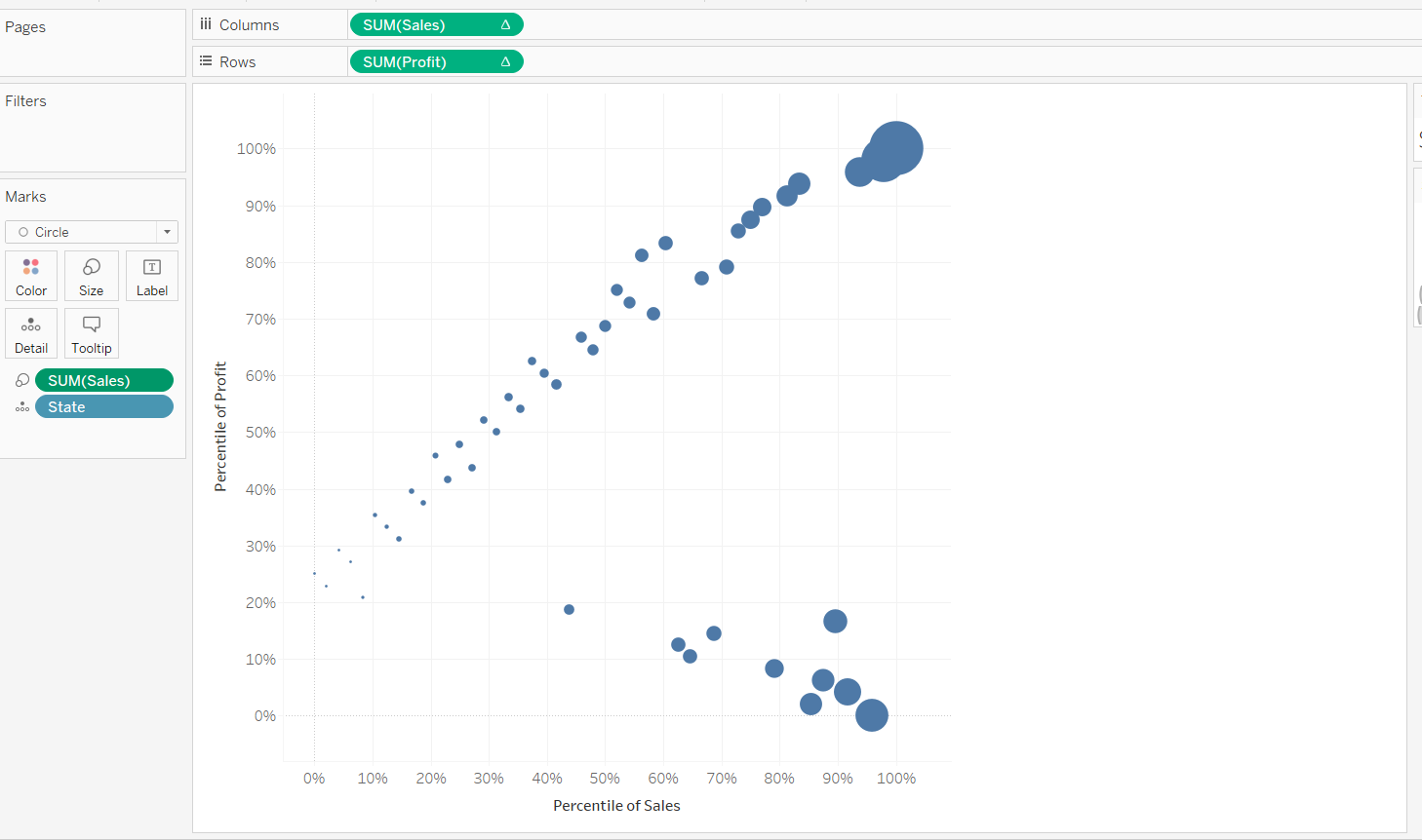
To make the scatter plot less cluttered, we can select “Percentile”.
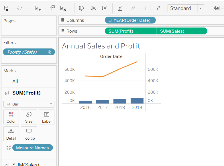
YTD Total, Compound Growth Rate, Year on Year Growth and YTD Growth can be used for time series visualisation.
We will next aggregate the points based on states, by using “Compute using State” and “Aggregate Measures” as shown below:
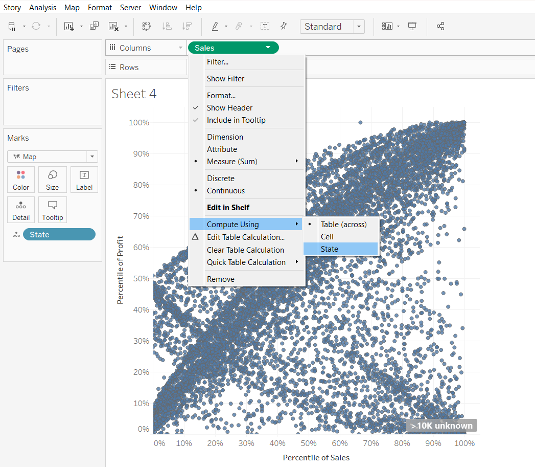
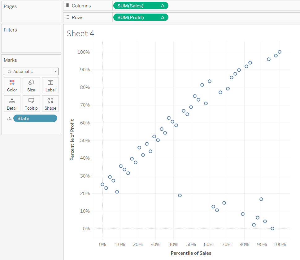
Resulting scatter plot as follows:
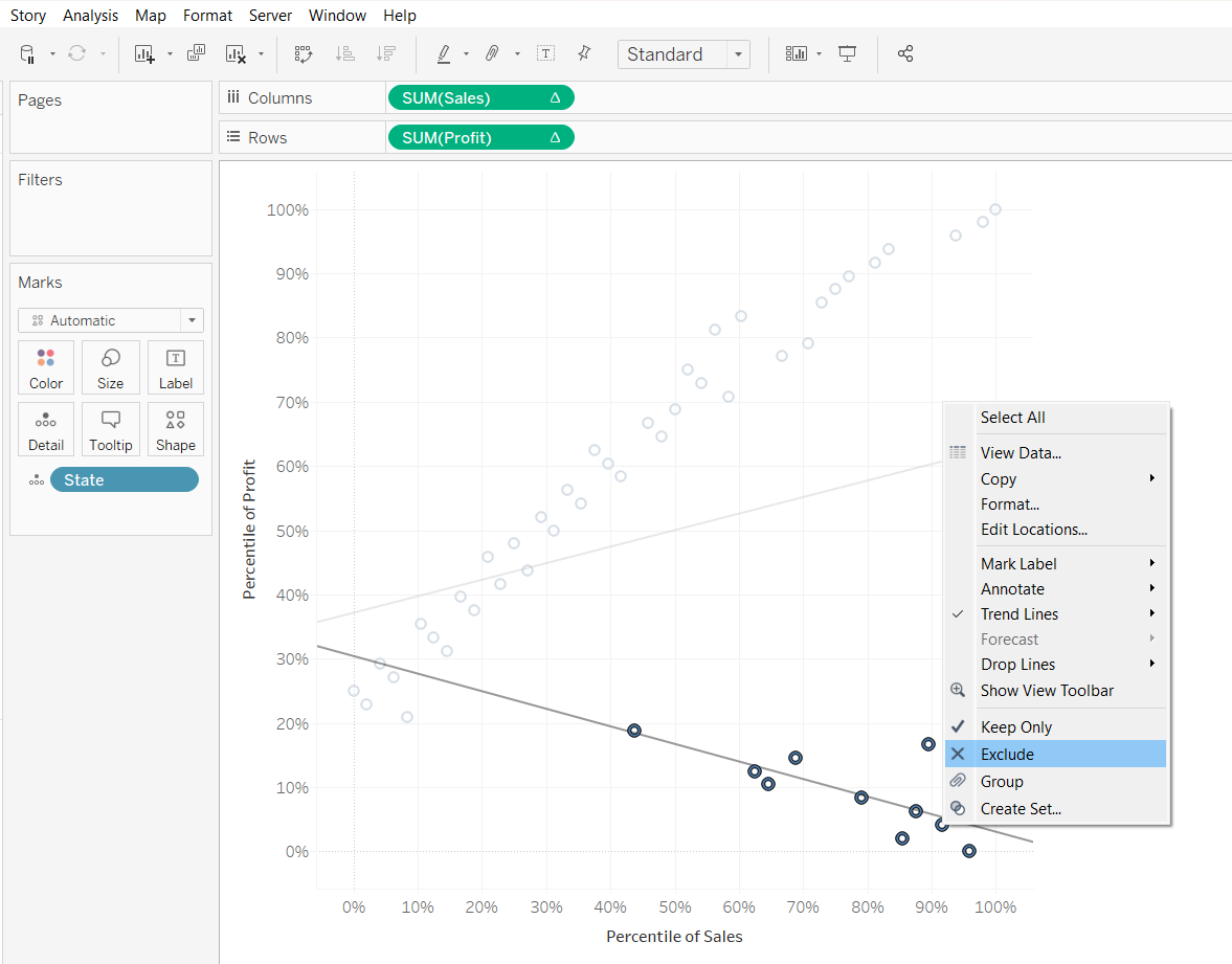
To insert trendlines, we can do so by selecting “Trend Line”. We can also derive the trend lines of specific observations by choosing specific points on the scatter plot.
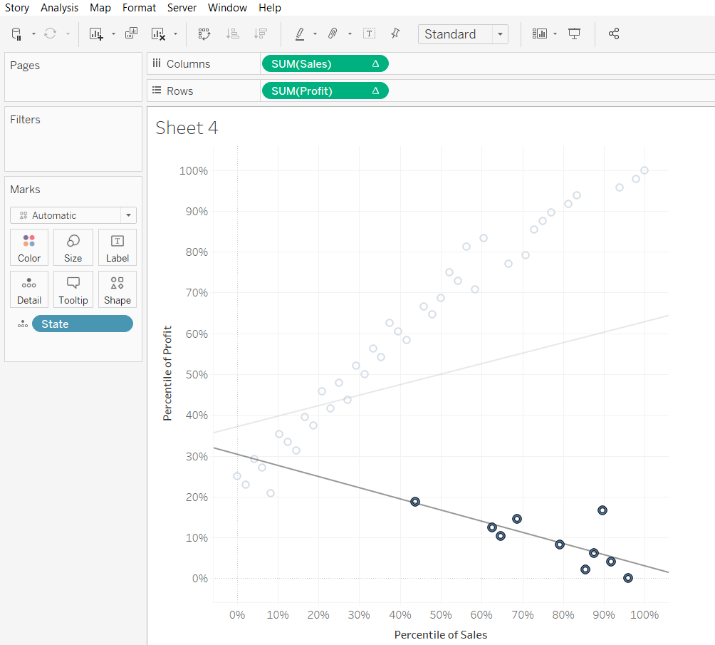
Unlike JMP where we can use the “lasso tool”, Tableau does not allow us to choose points of odd shapes. To overcome this, we need to select using the box select tool, then unselect those points we do not want.
Next, we will change the size of the scatter plot. First, we drag “sales” to “Size”
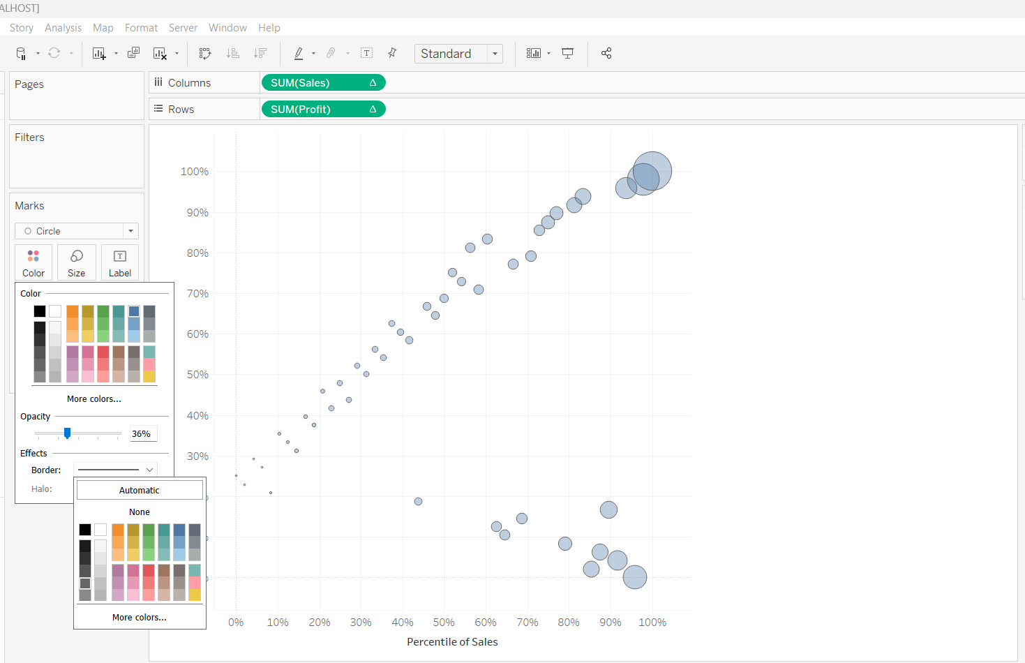
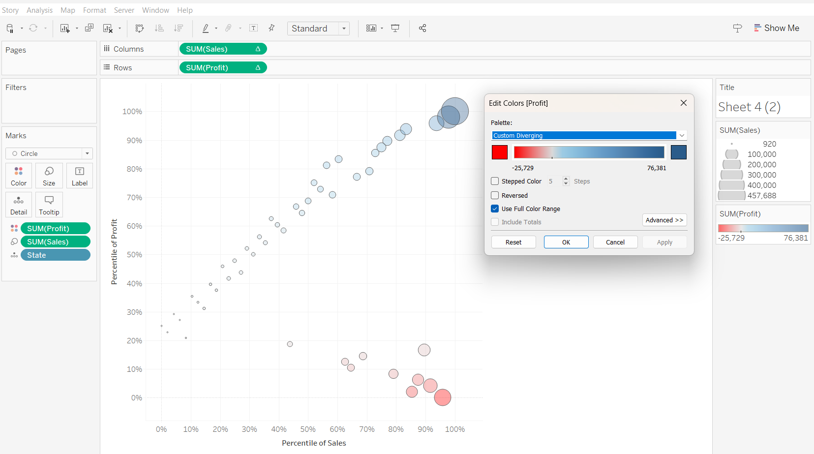
Next, changing the colour and opacity of the scatter plot.
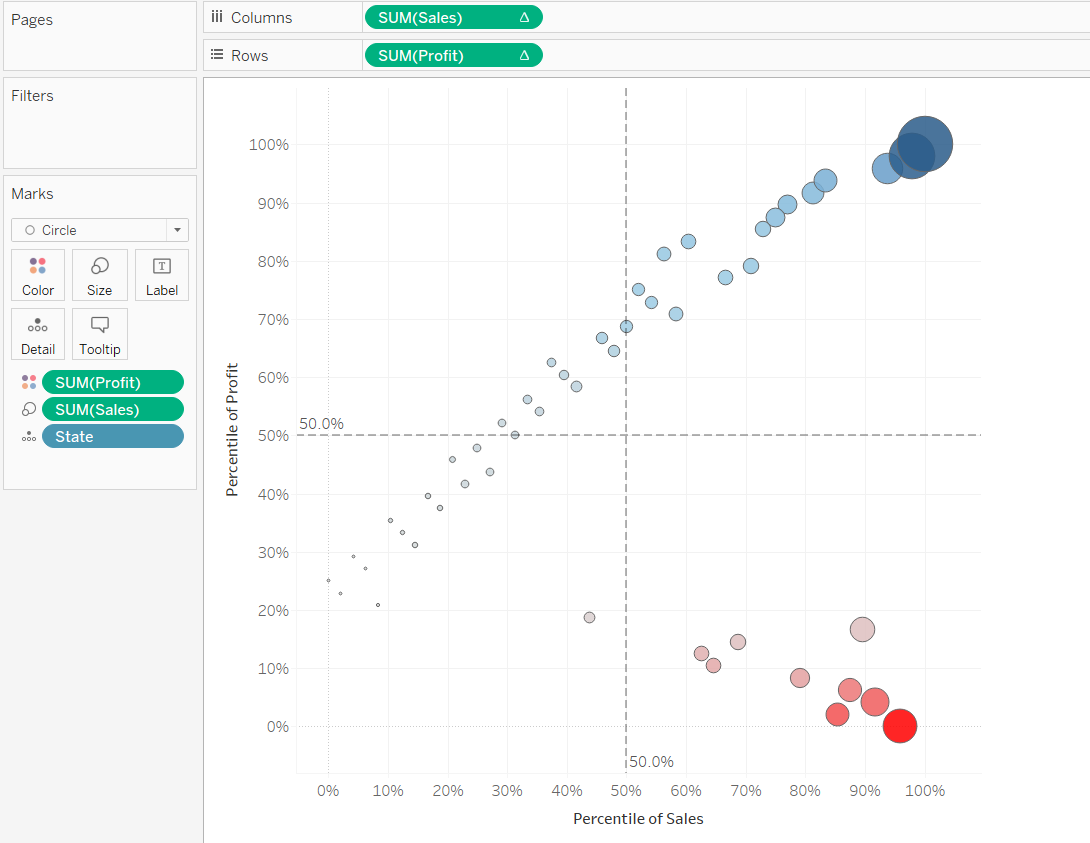
We will also plot reference lines on the scatterplot so as to better visualise how the observations can be catergorised into four different quadrants.
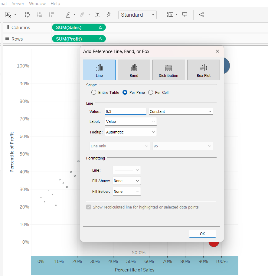
We will now have a scatterplot categorised into four quadrants
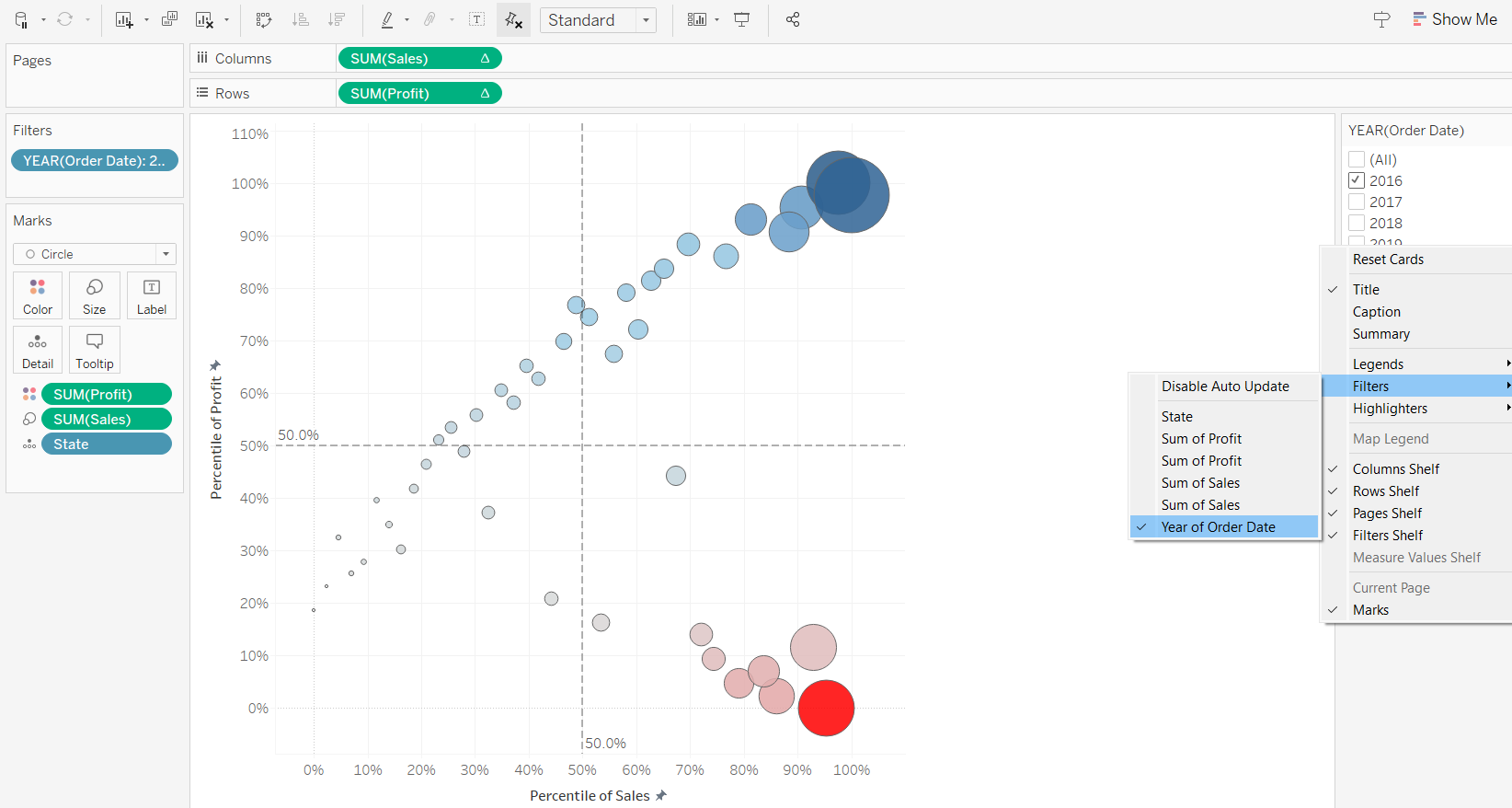
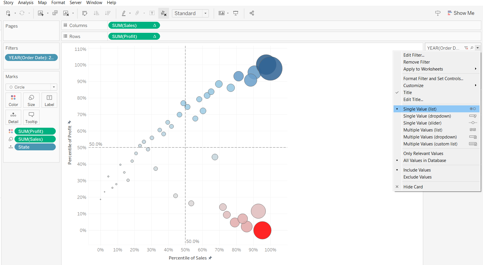
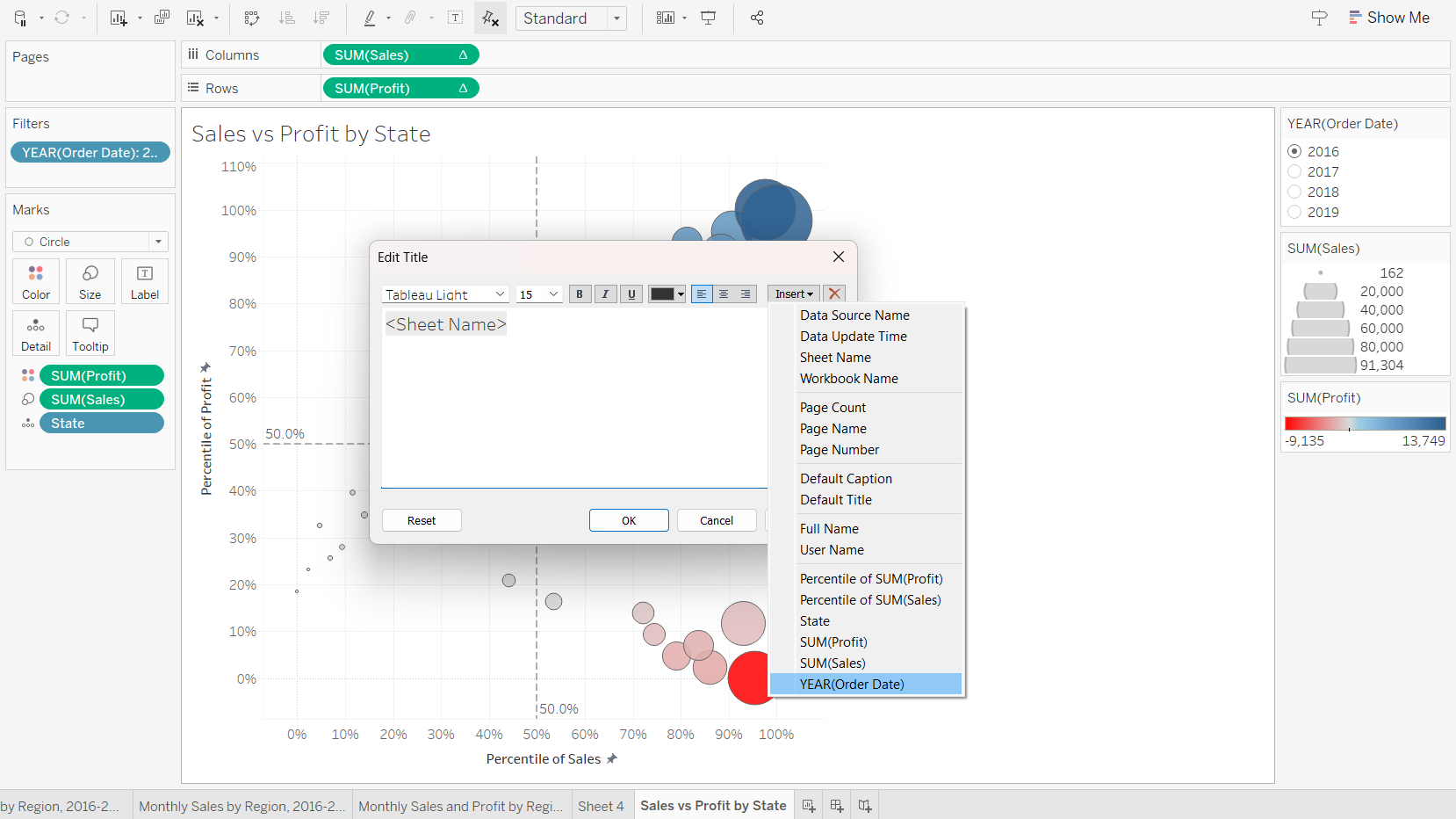
We can also add a “Filter” option on the scatter plot to improve the interactivity.
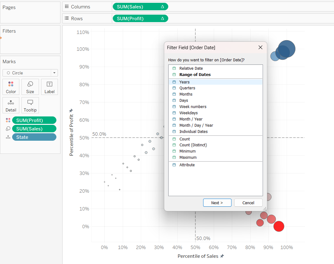
Although we can display the filter panel on the right, but we notice that the graph disappears when none of the options are checked, which can lead to unnecessary panic.
To prevent that, we can mandate that at least one option needs to be chosen.
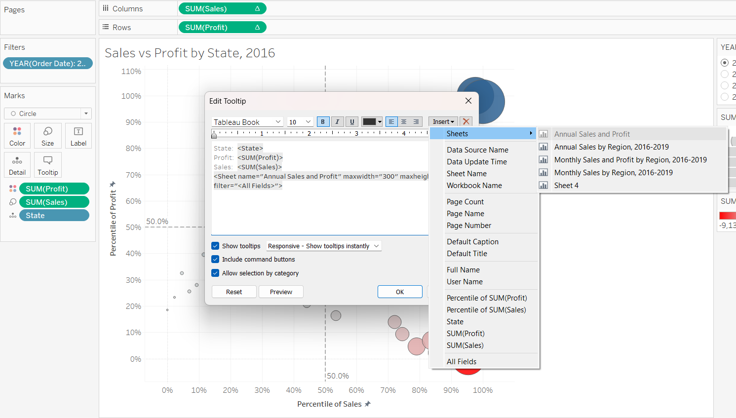
We can help readers zoom into the details of each point. First, we need to create a new sheet name to follow the selected year. We will create a new sheet, and create a new annual sales and profit chart.
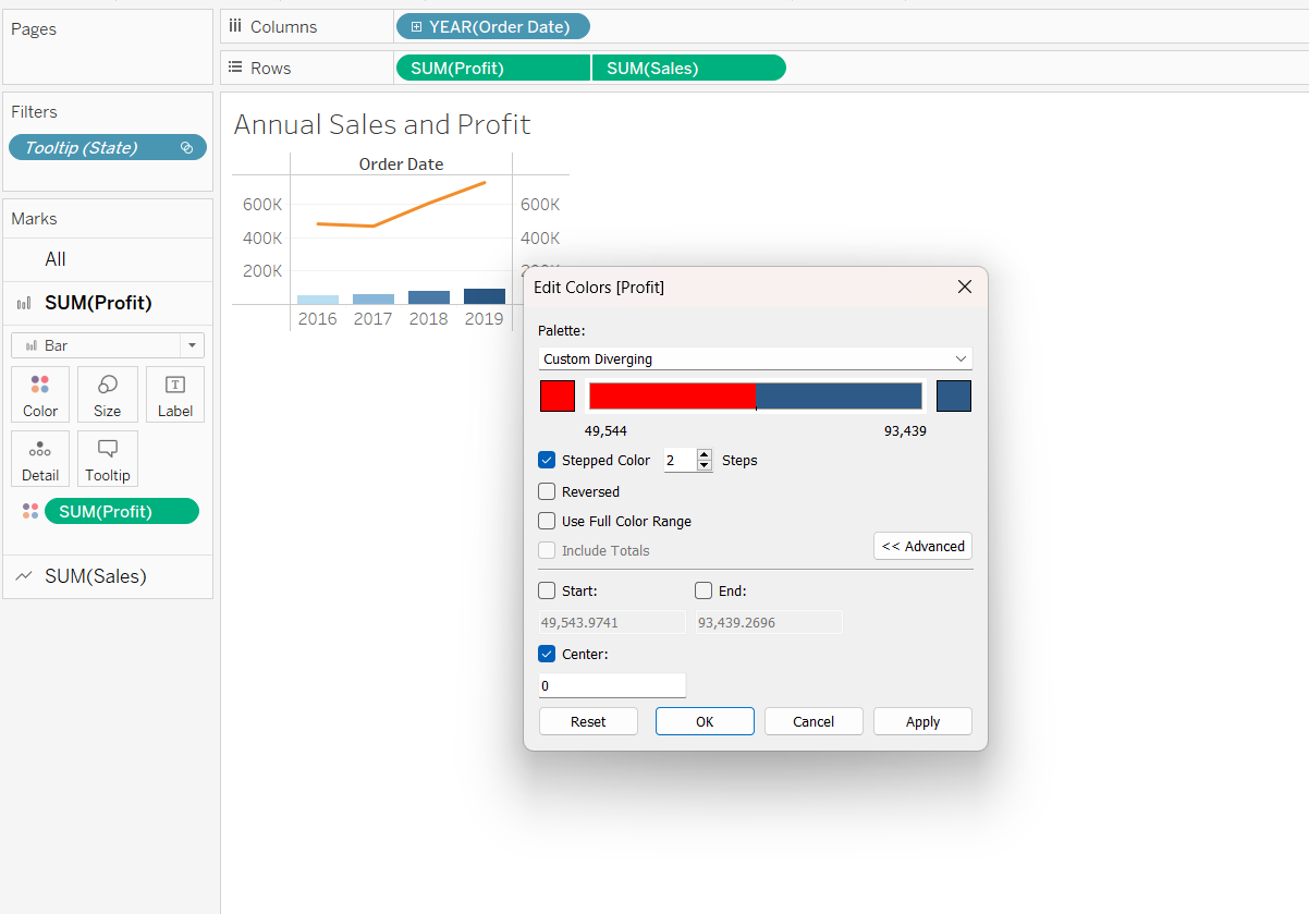
Creating a dual axis for profits, so that the profits and losses will be reflected in blue and red respectively.
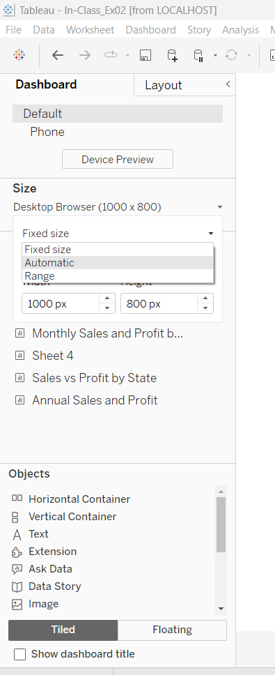
Resizing the charts so that we can view on both desktop and handphone.
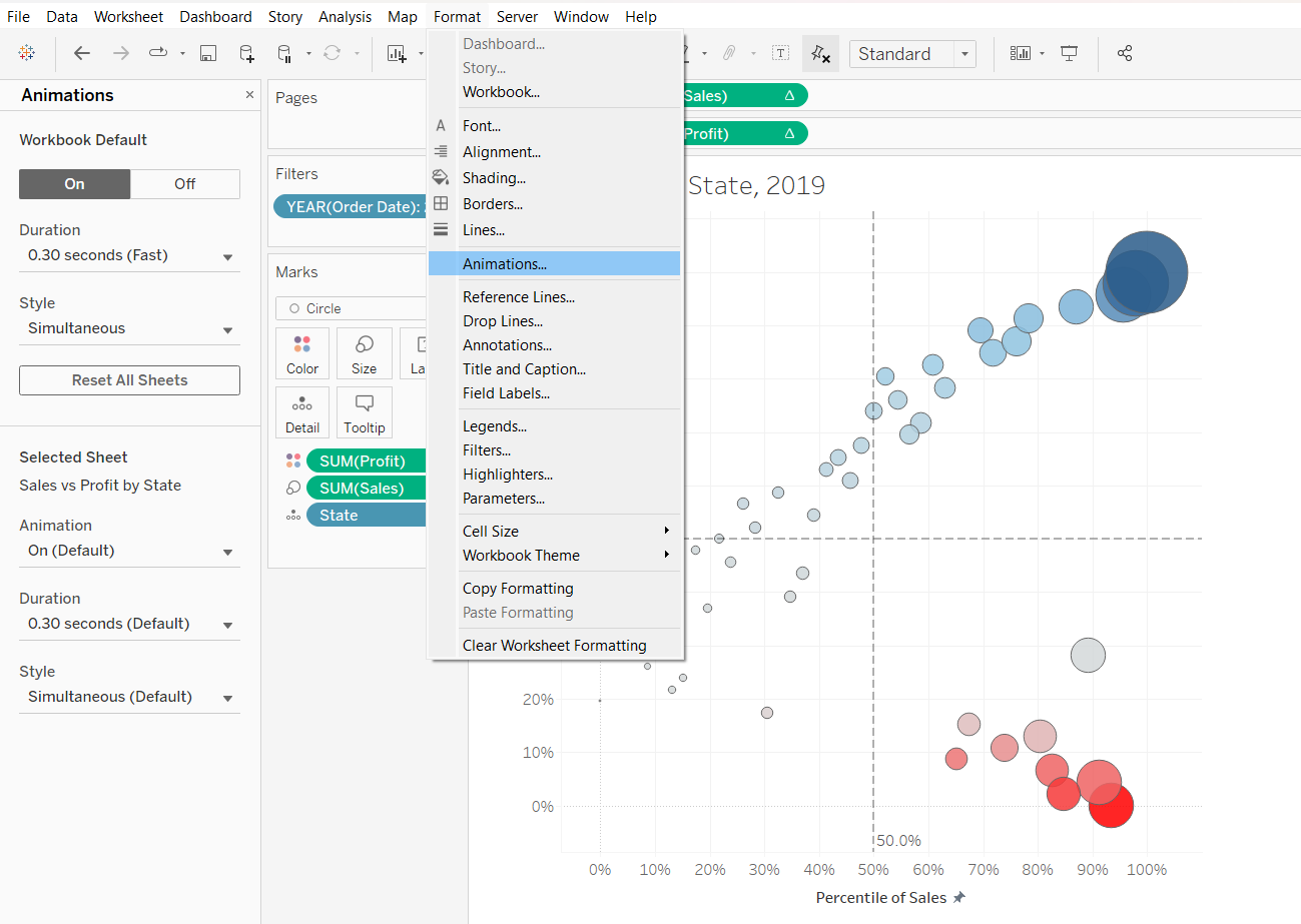
We can also customising the animation effects that we want to visualise on the scatter plot.
Inserting details
And now, we have an interactive scatter plot.
3.2 Creating Dashboards and Story Points
We can use dashboards to combine different visualisation sheets together.
We can use story points to combine different visualisation sheets and/or dashboards together.
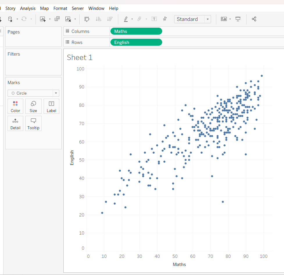
We will practice this by importing the Exam_data.csv, then creating scatterplot and adjust the size and shape.
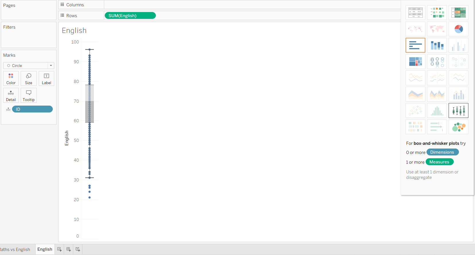
We would like to add a boxplot to the scatter plot. To do this, we will click on “Show Me”. We noticed that the boxplot option is actually greyed out, and we are unable to select this option. To overcome this, we will first click on Histogram, which then allows to select the boxplot option.
Thereafter, we will drag “ID” into Detail, and replace “CNT(English)” with “SUM(English)”.
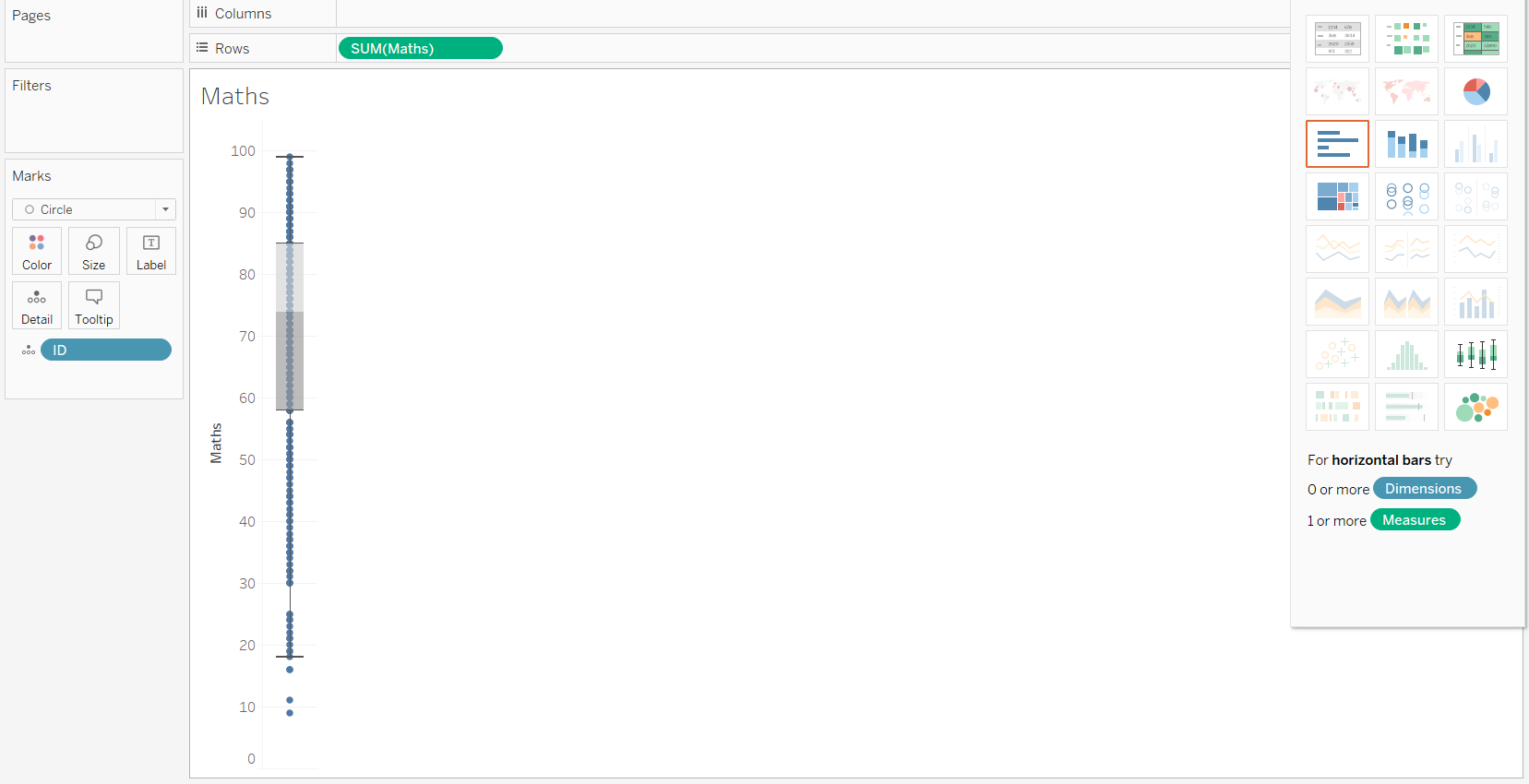
We will duplicate the sheet and change “SUM(Engligh)” to “SUM(Maths)” to display the maths scores.
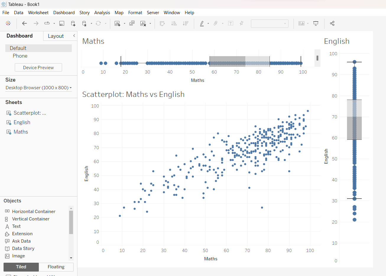
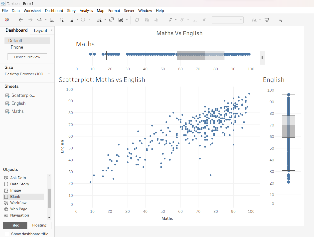
We will now use a Dashboard to piece the scatterplot and boxplots together.
3.3 Creating Coordinated Link View for Interactivity
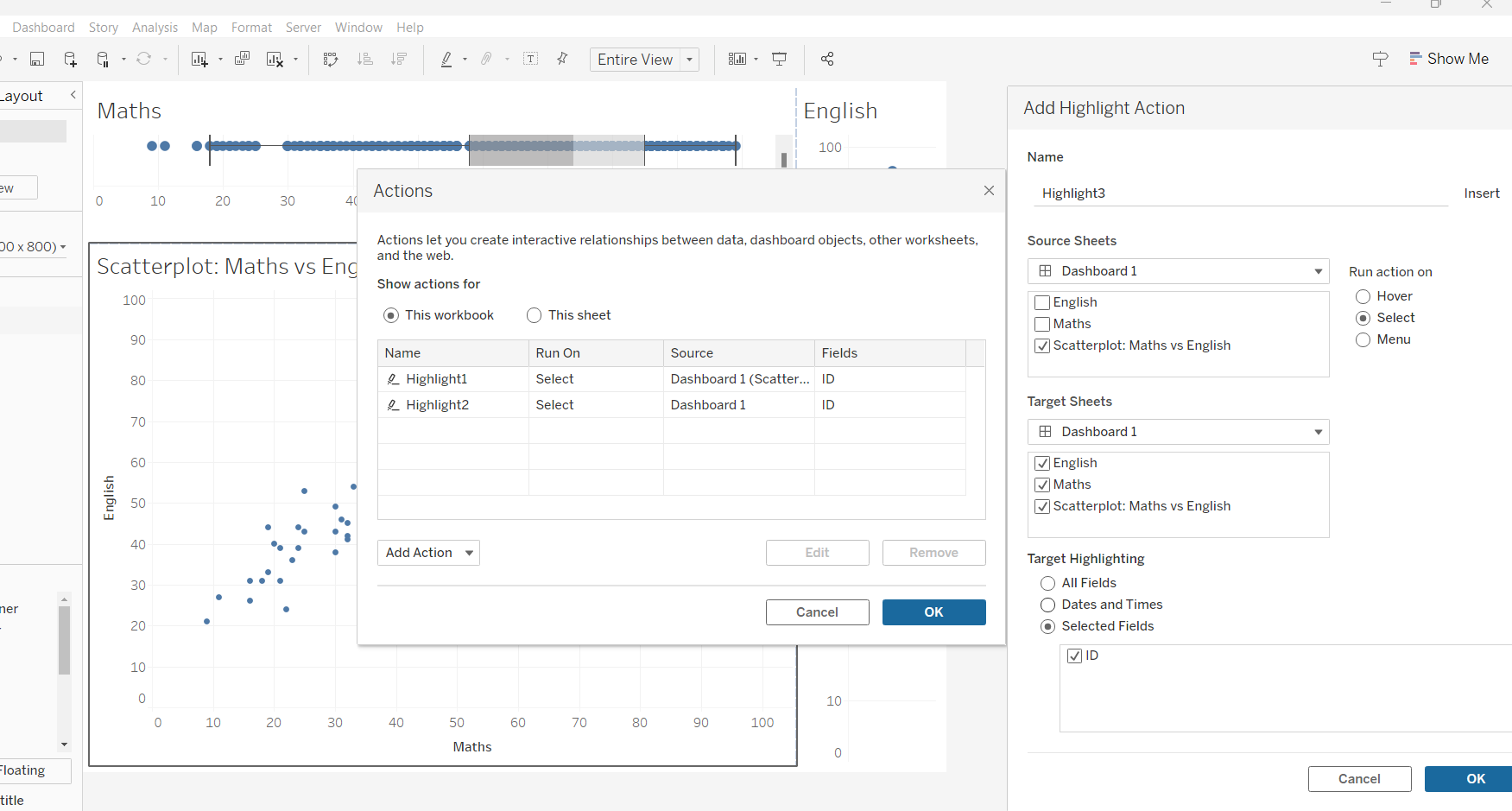
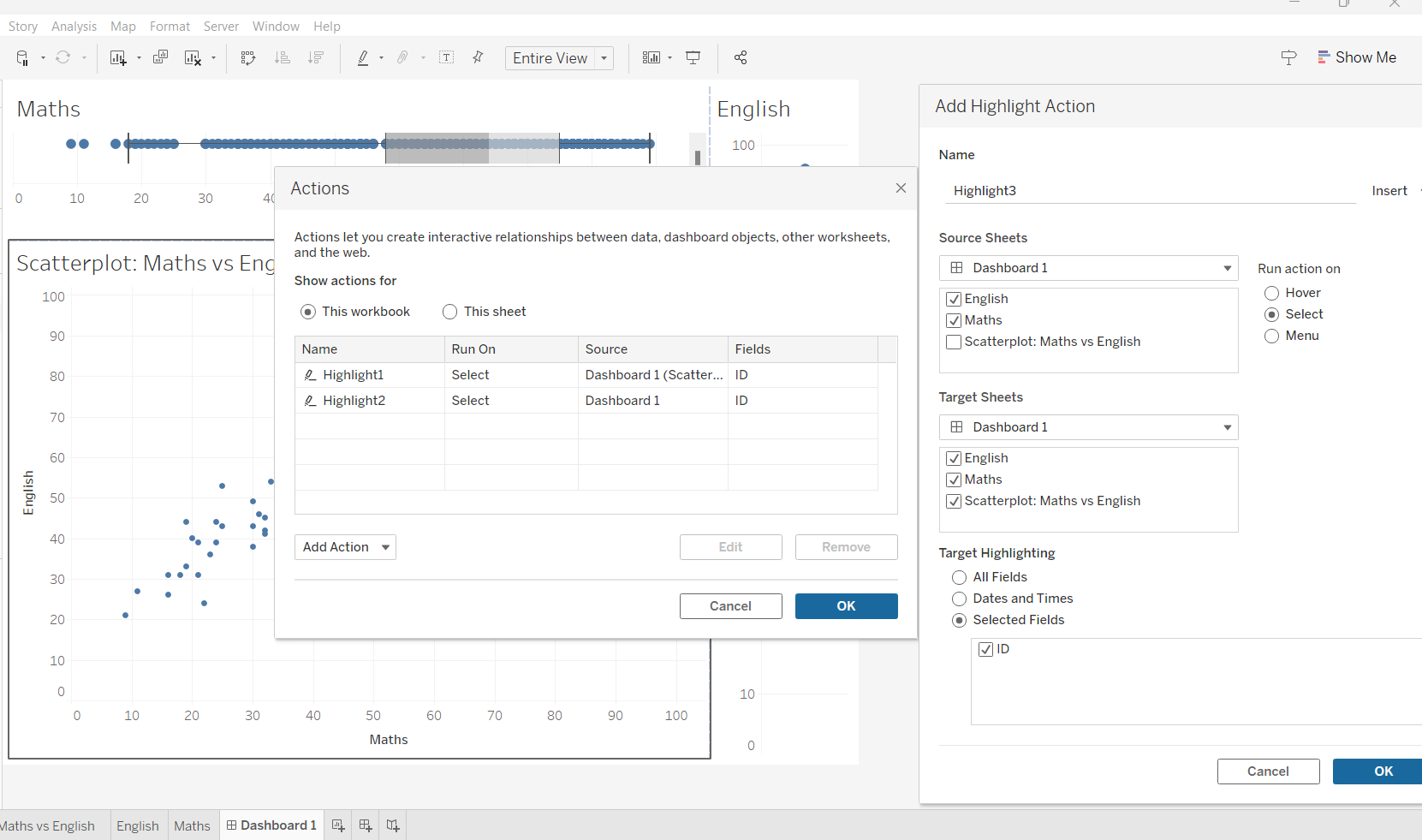
To create a coordinated link view, we will check the aggregation for scatterplot, then drag “ID” into the Detail for each of the three sheets. This will allow the common identifiable between the three sheets to be “ID”.
First, we will work on the scatter plot. Click Dashboard/ Actions/ Add actions/ Highlight and check those sheets that we want to be coordinated, as shown below:
We will repeat the above step for both Maths and English boxplots. This allows the points on the scatterplot to be selected when readers select any point on either of the boxplot.
We can adjust the layout (aka stitching) so that the axes across the different plots are synchronised, using Dashboard/Blank.
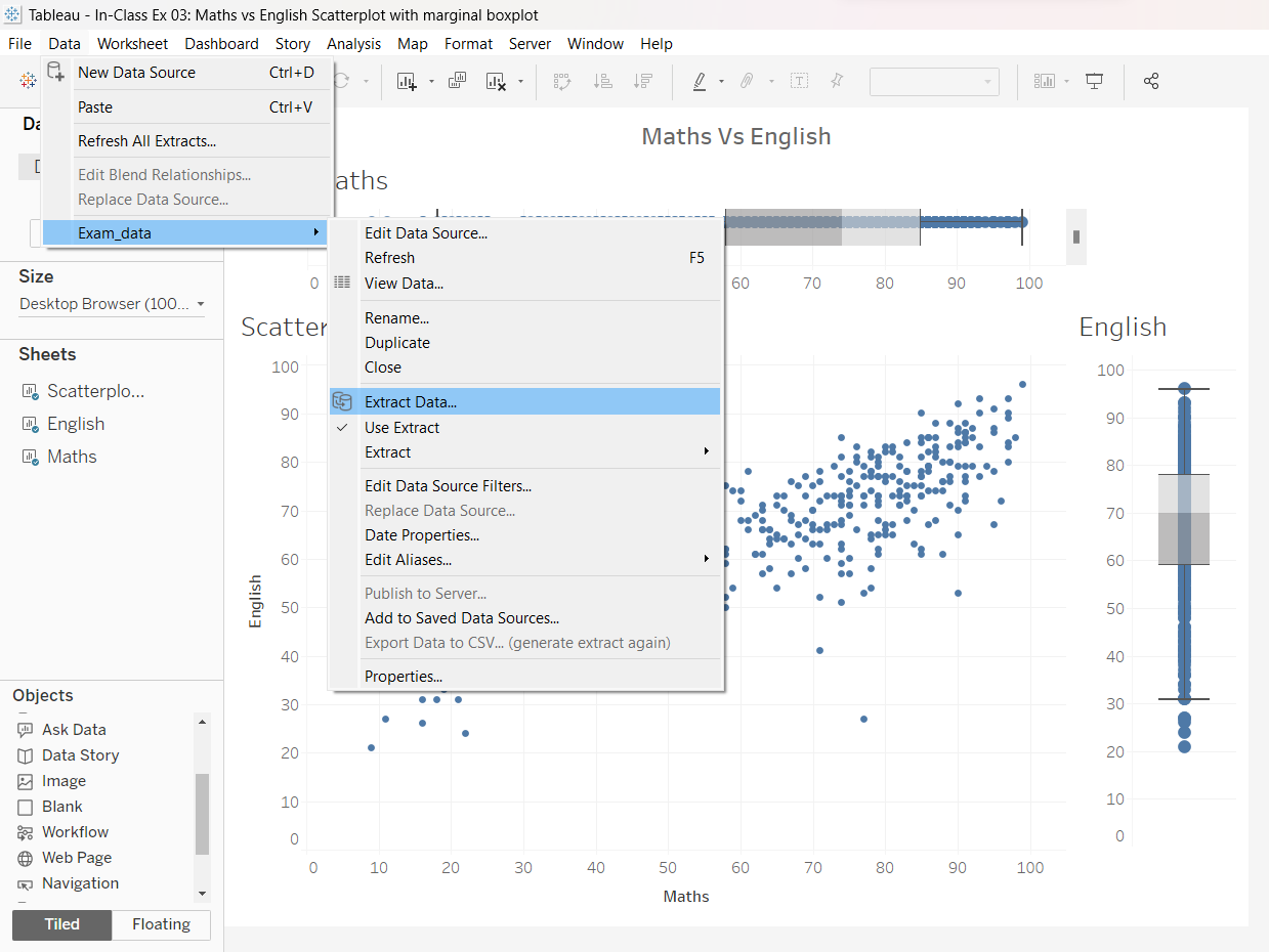
As this is the first time we are using the Exam_data.csv, we will need to extract the exam_data before publishing.
4 Saving to Tableau Public
Finally, we will complete this exercise by publishing our work to Tableau Public. Go to “Server/ Tableau Public/ Save to Tableau Public”. Before that, remember to rename your worksheets and save your file as a “Tableau Extract” file.