Rows: 1,548
Columns: 8
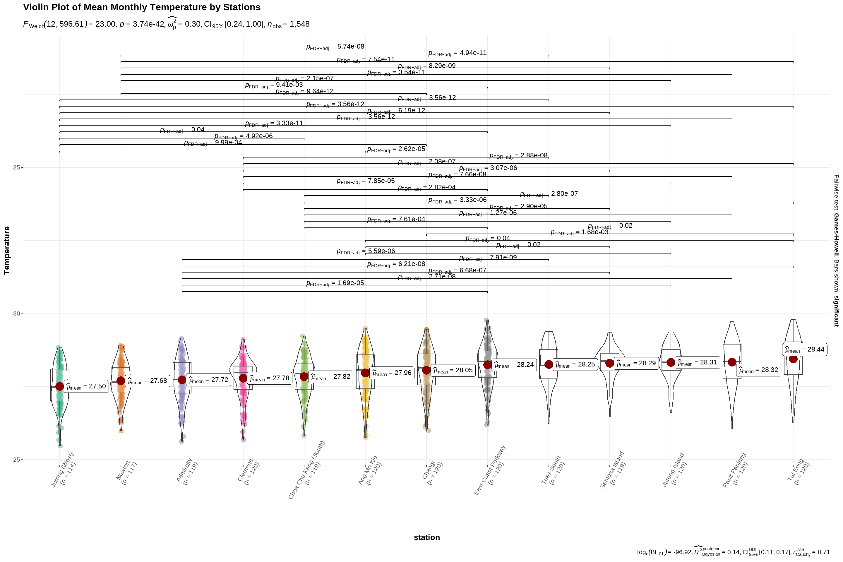
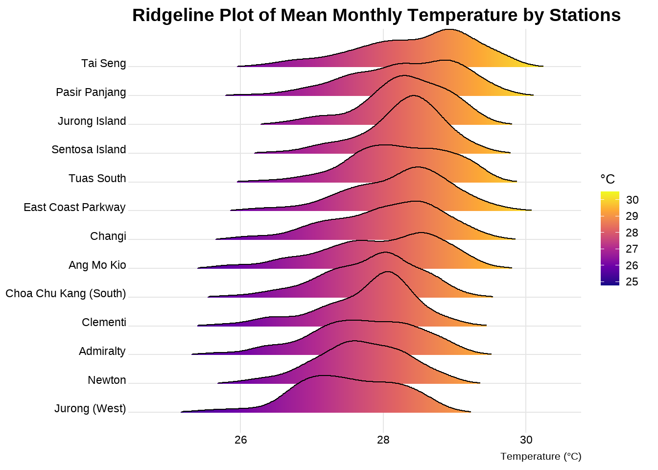
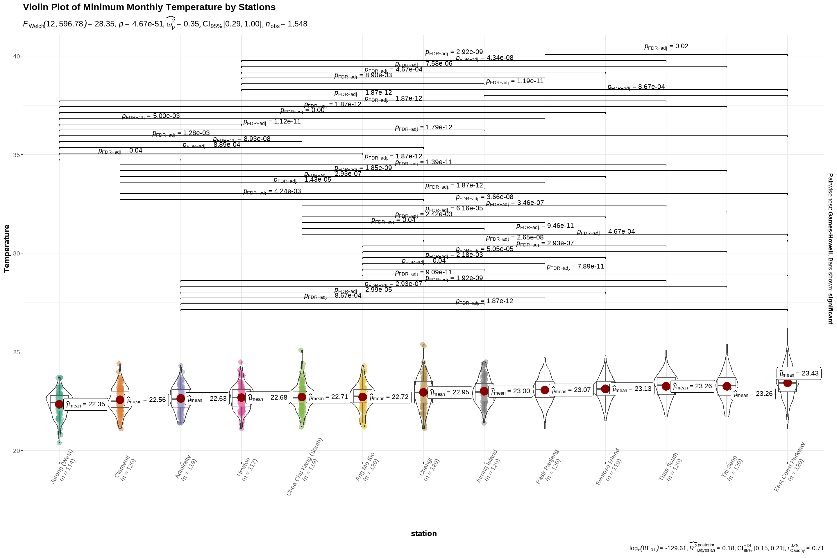
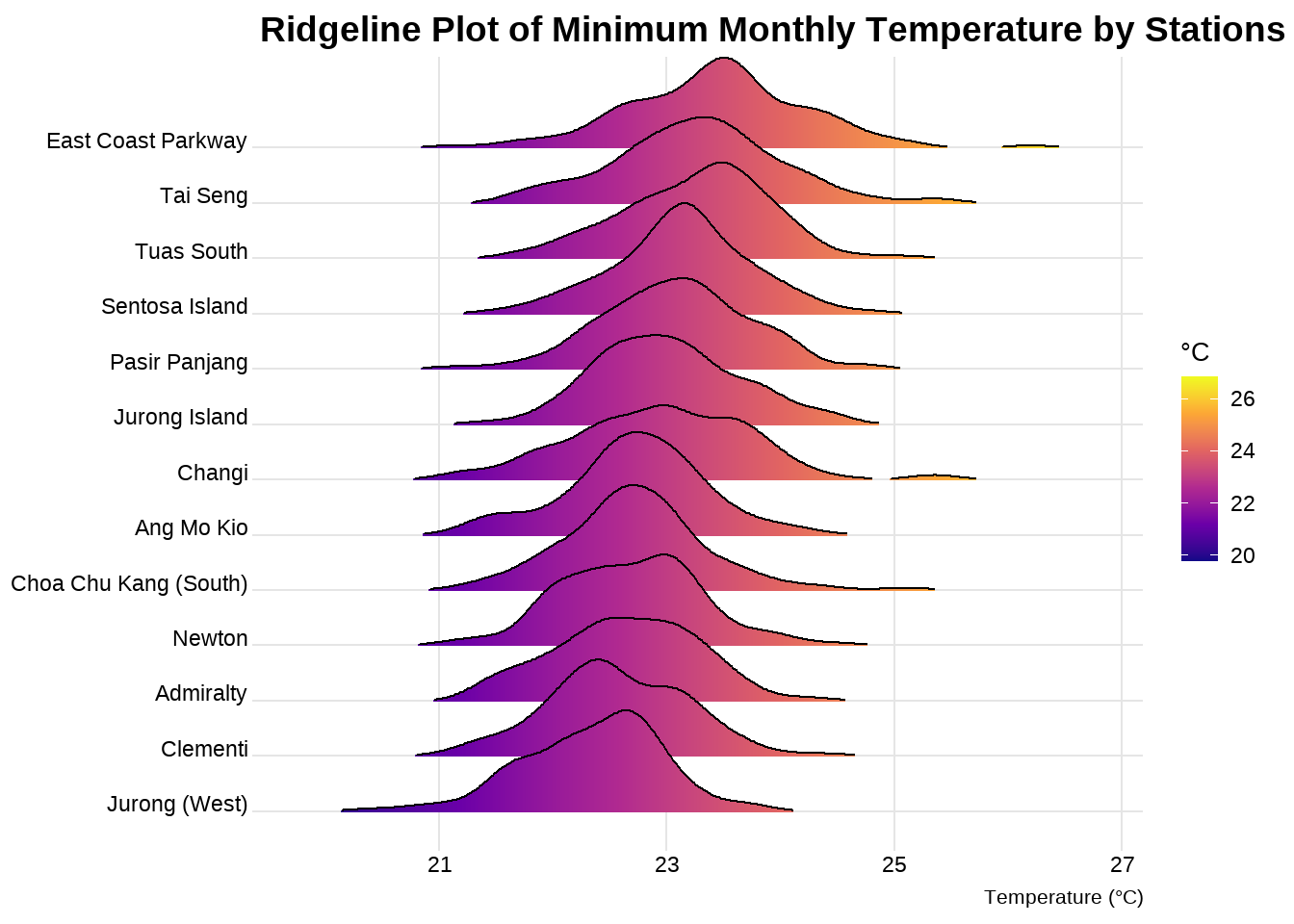
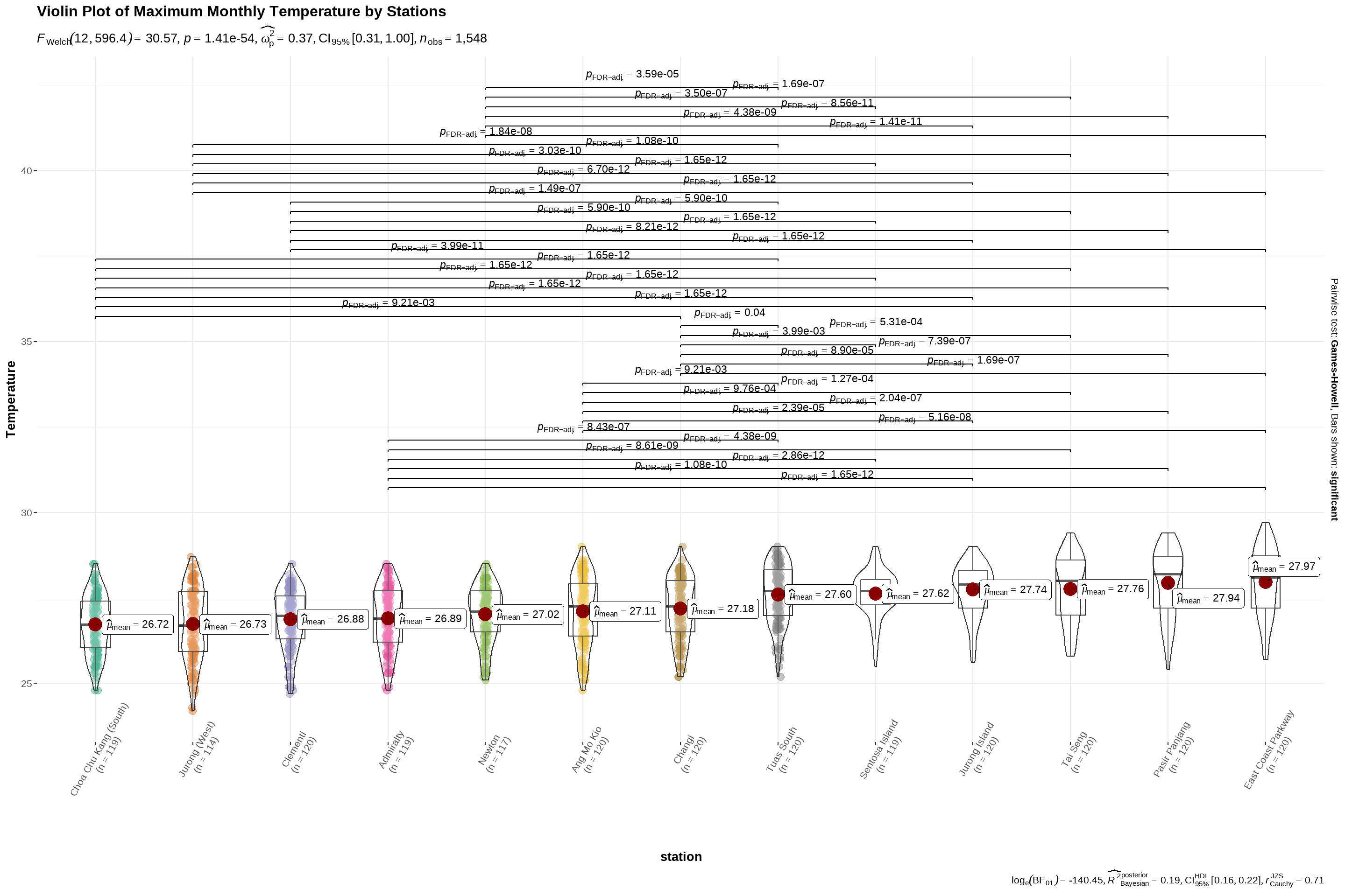
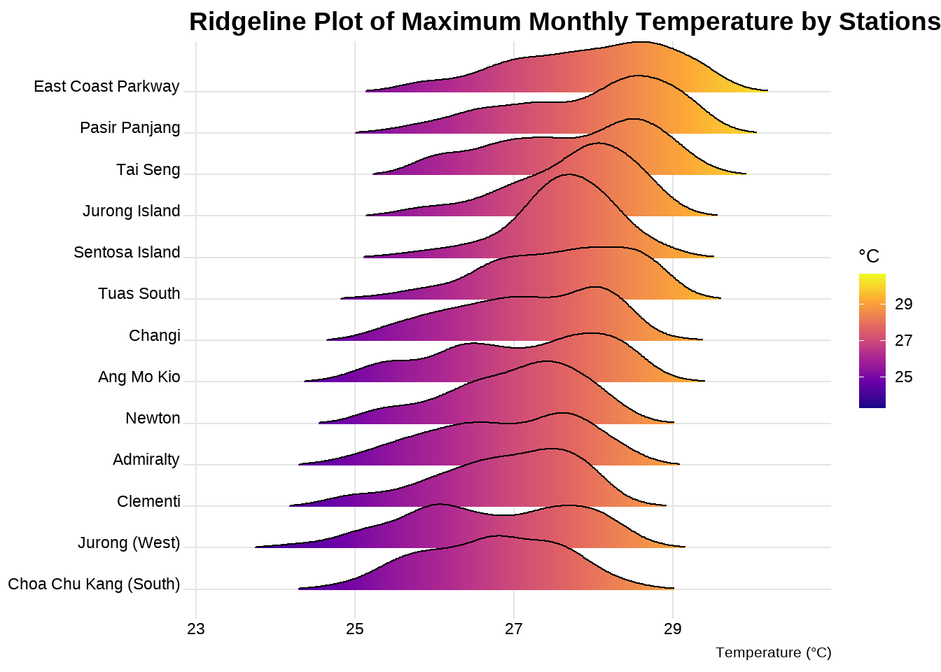
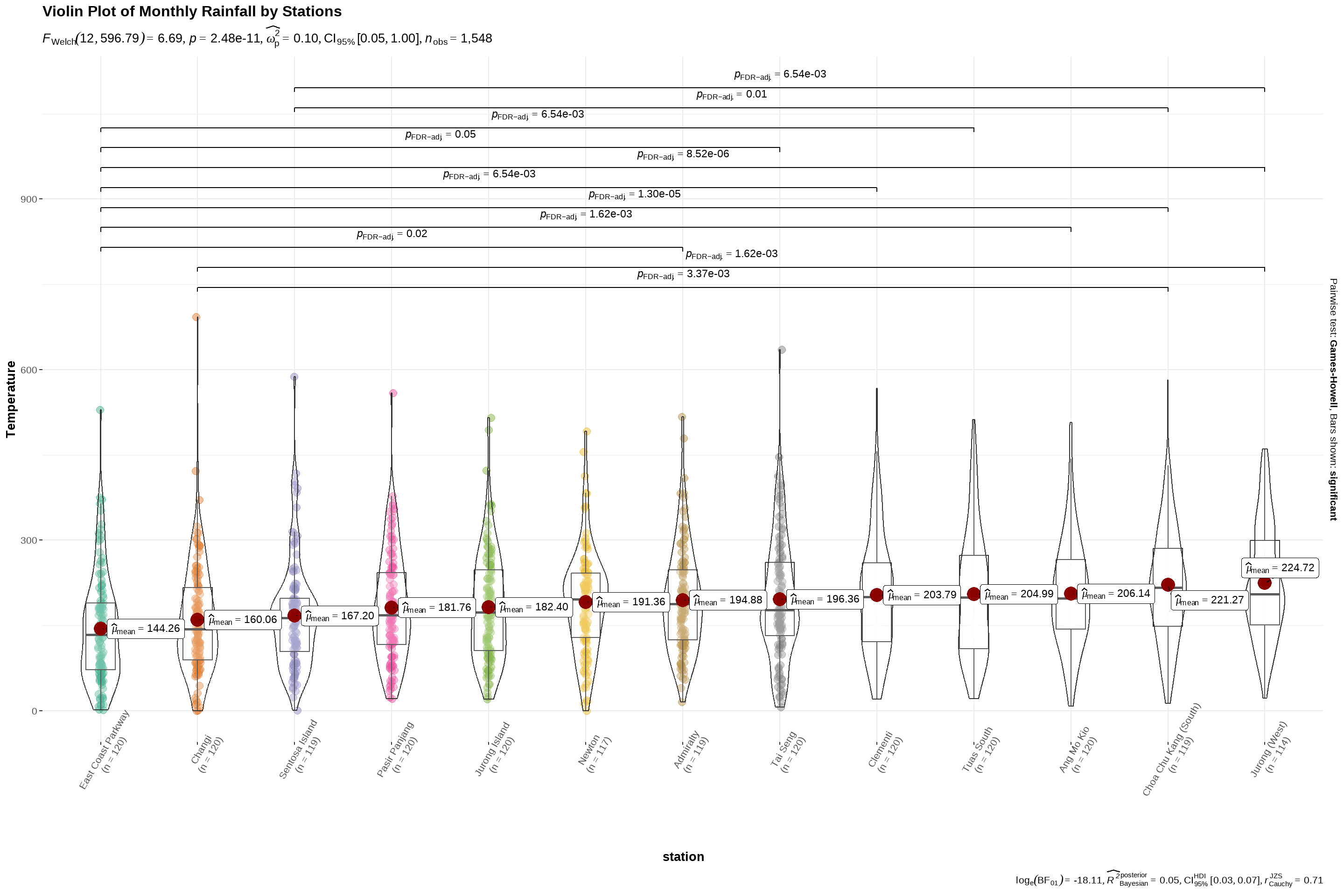
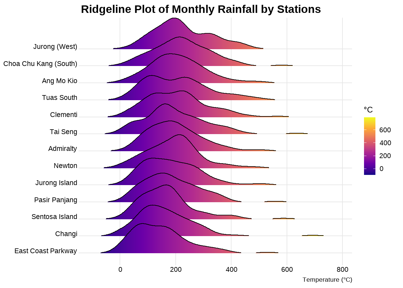
Groups: station [13]
$ station <chr> "Admiralty", "Admiralty", "Admiralty", "Admir…
$ tdate <date> 2014-01-01, 2014-02-01, 2014-03-01, 2014-04-…
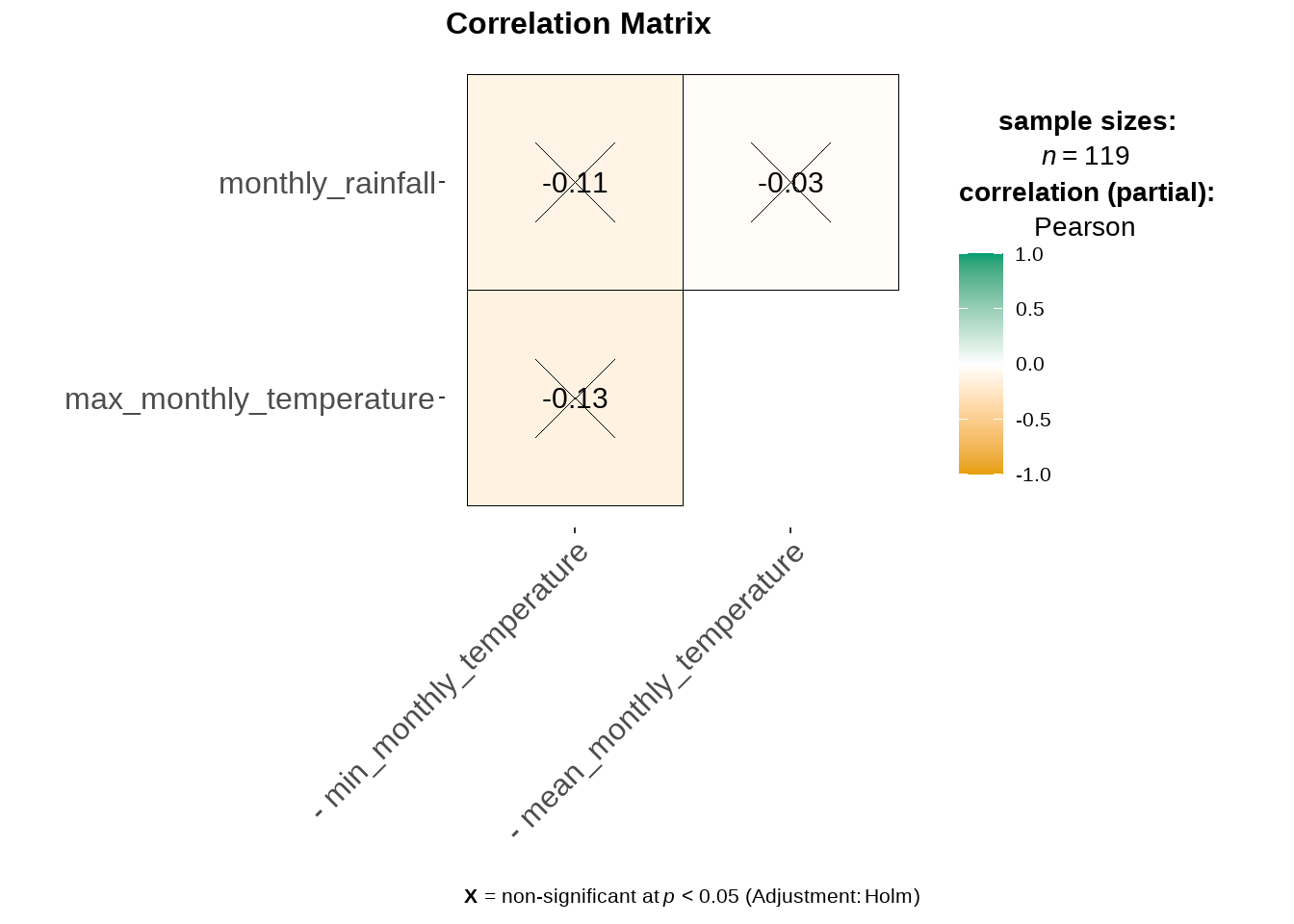
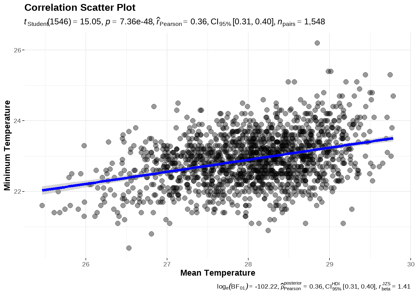
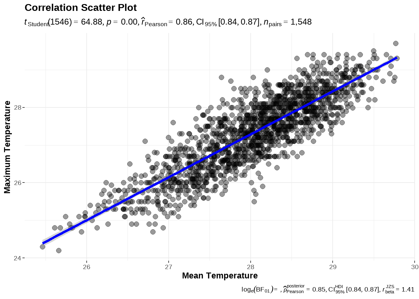
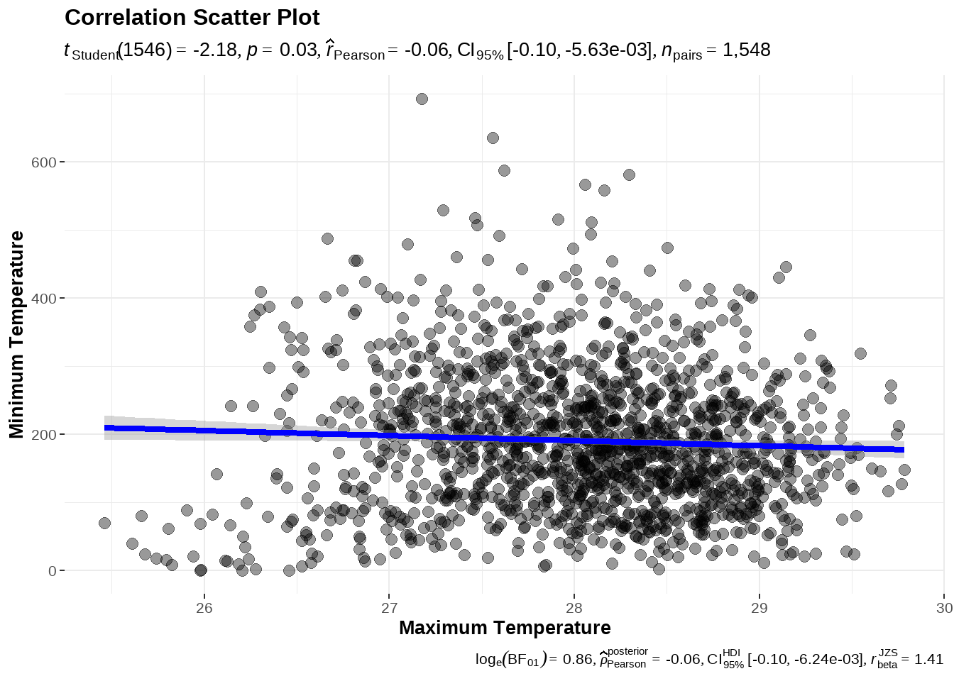
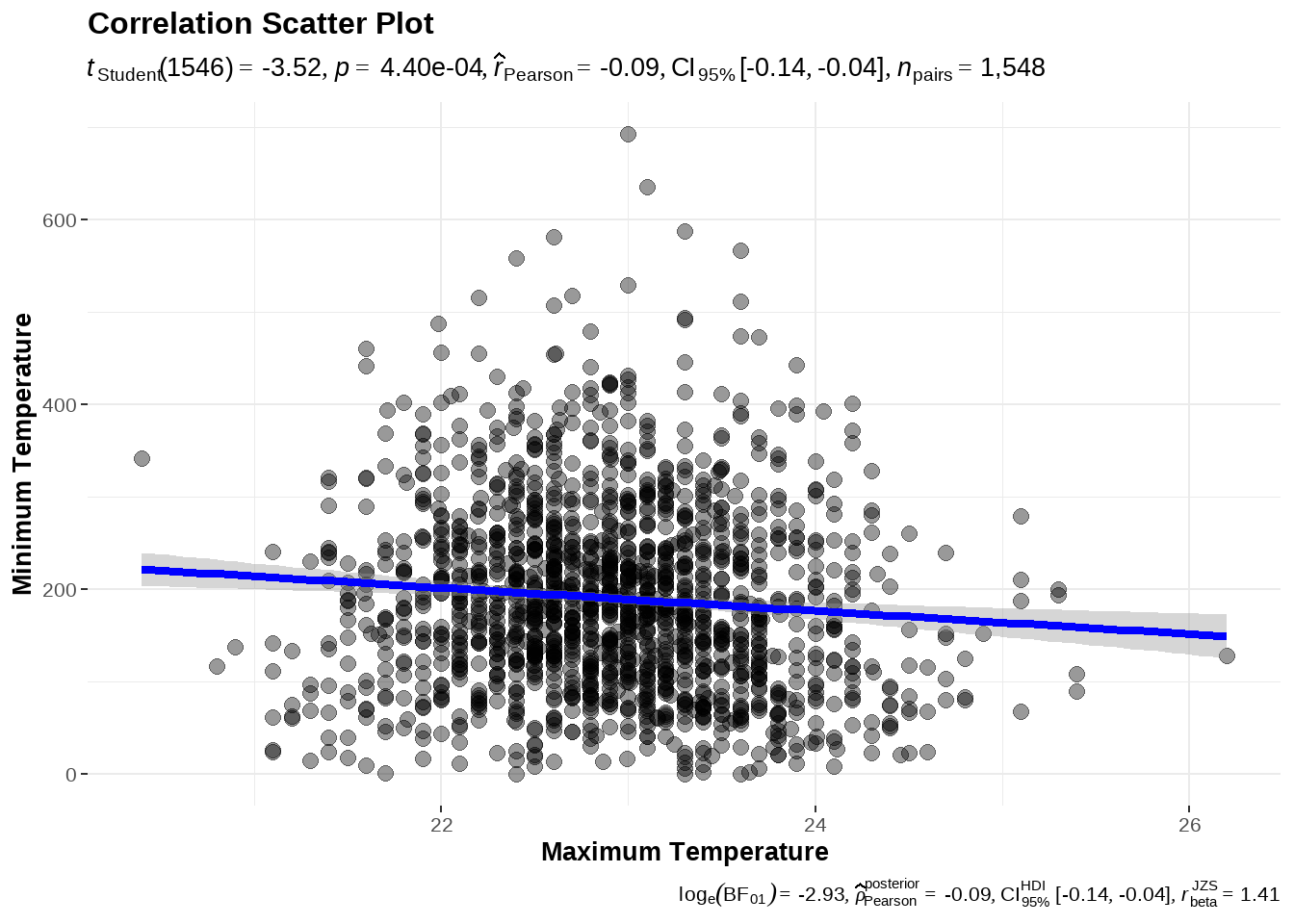
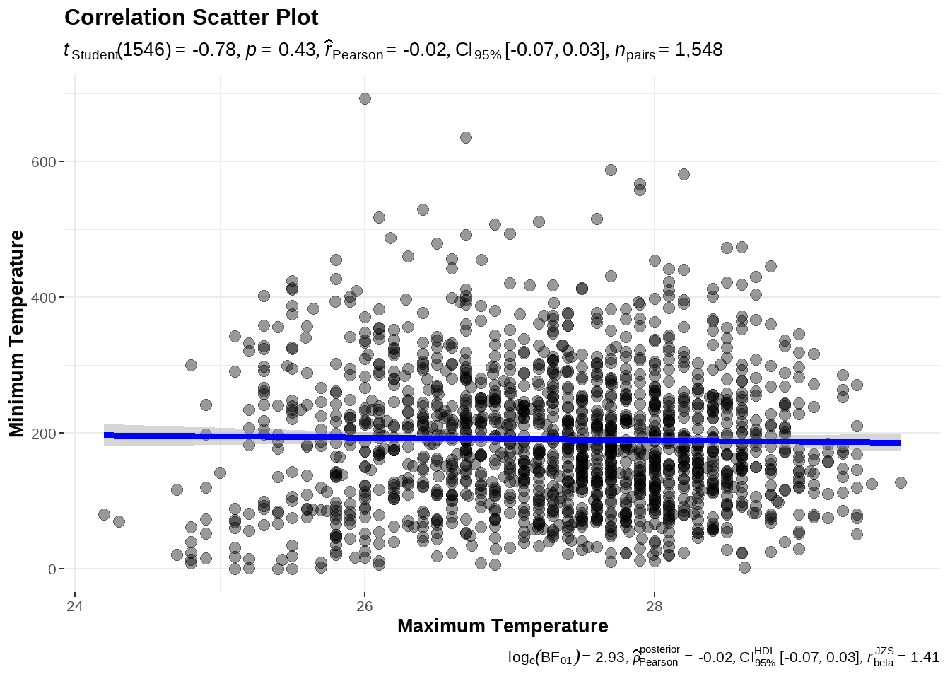
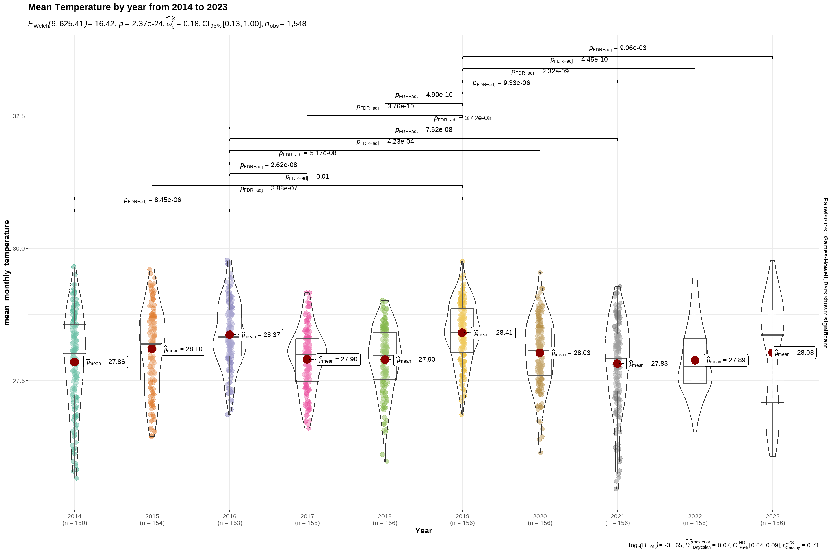
$ mean_monthly_temperature <dbl> 26.22903, 25.79355, 26.76071, 27.35484, 27.81…
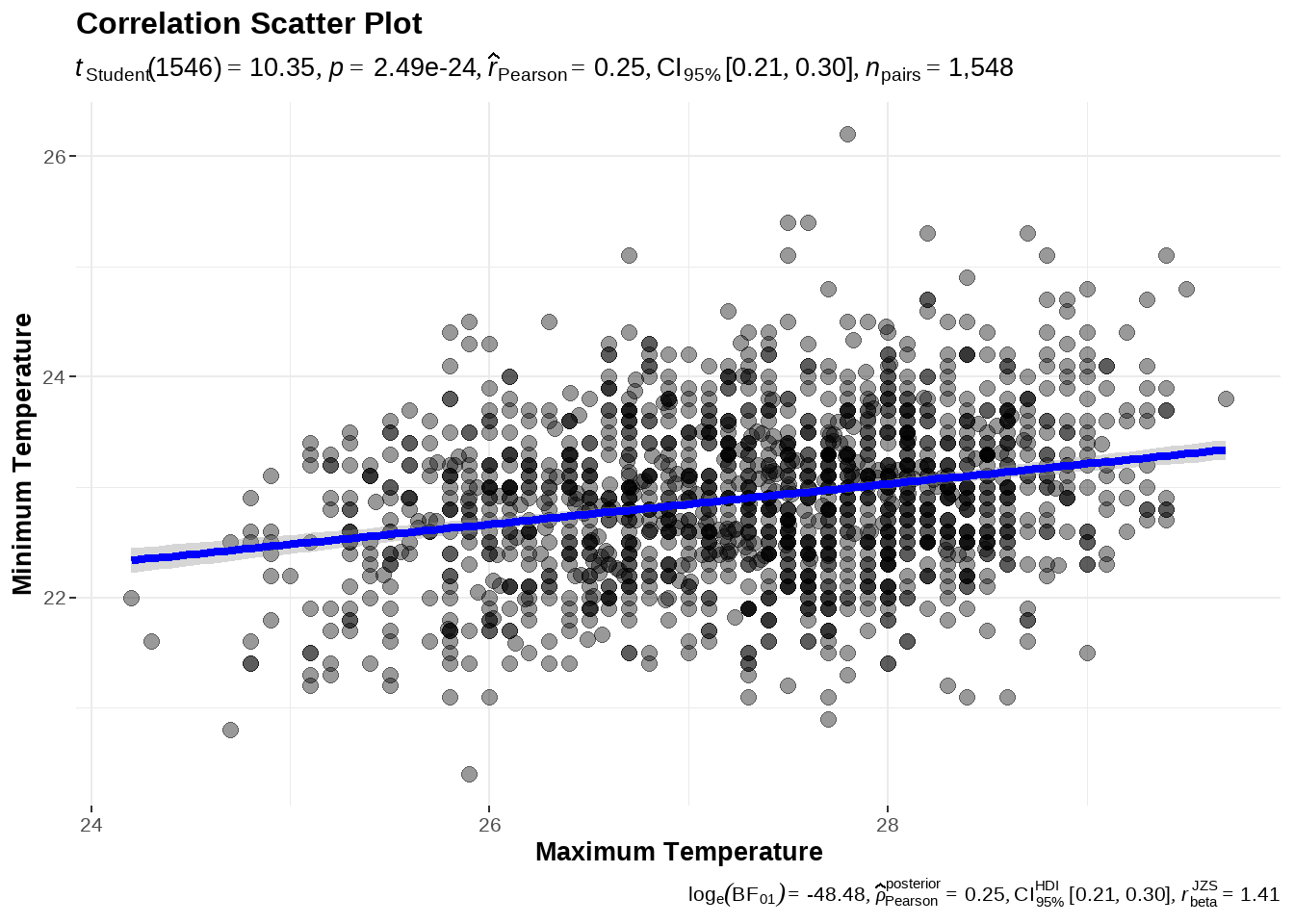
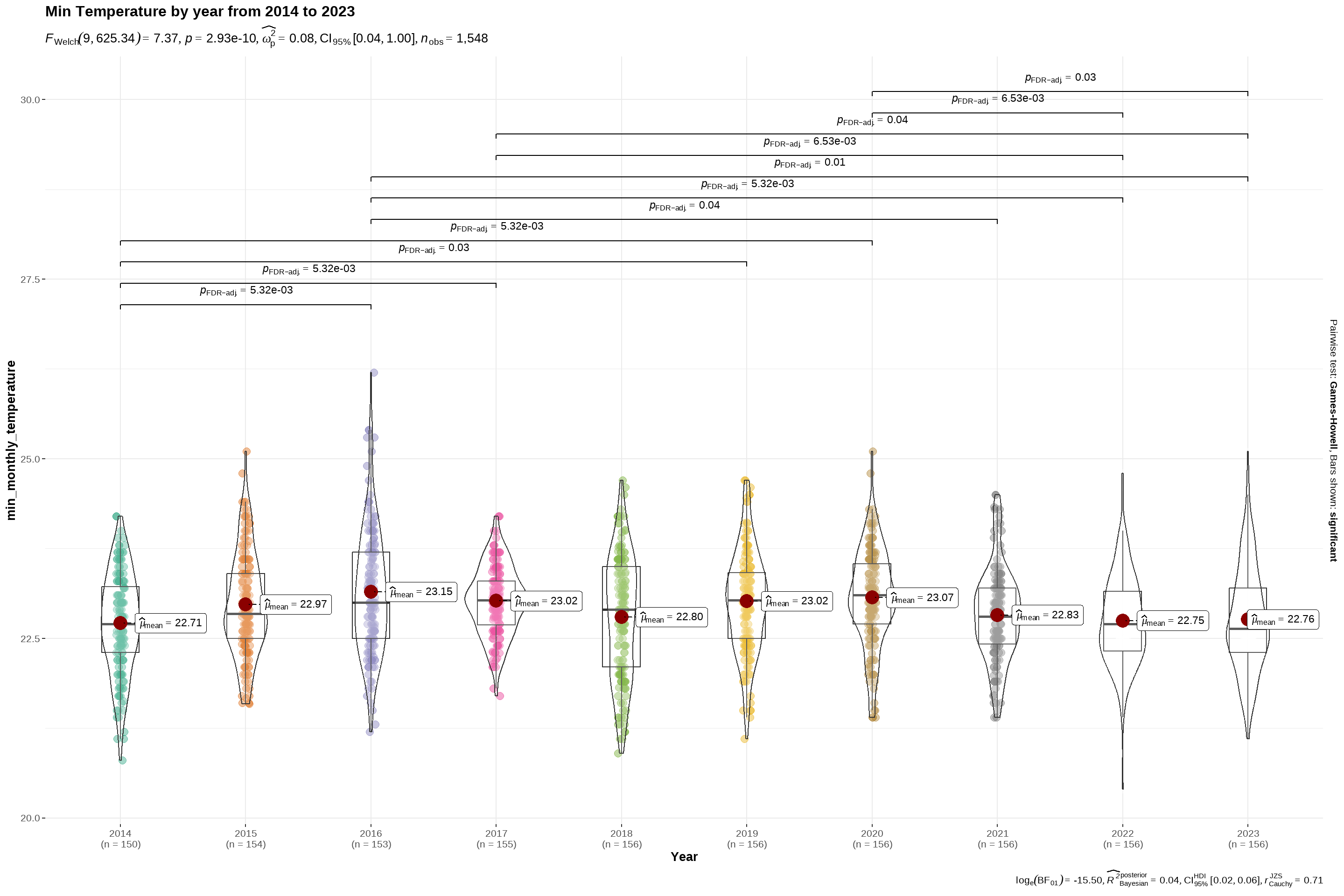
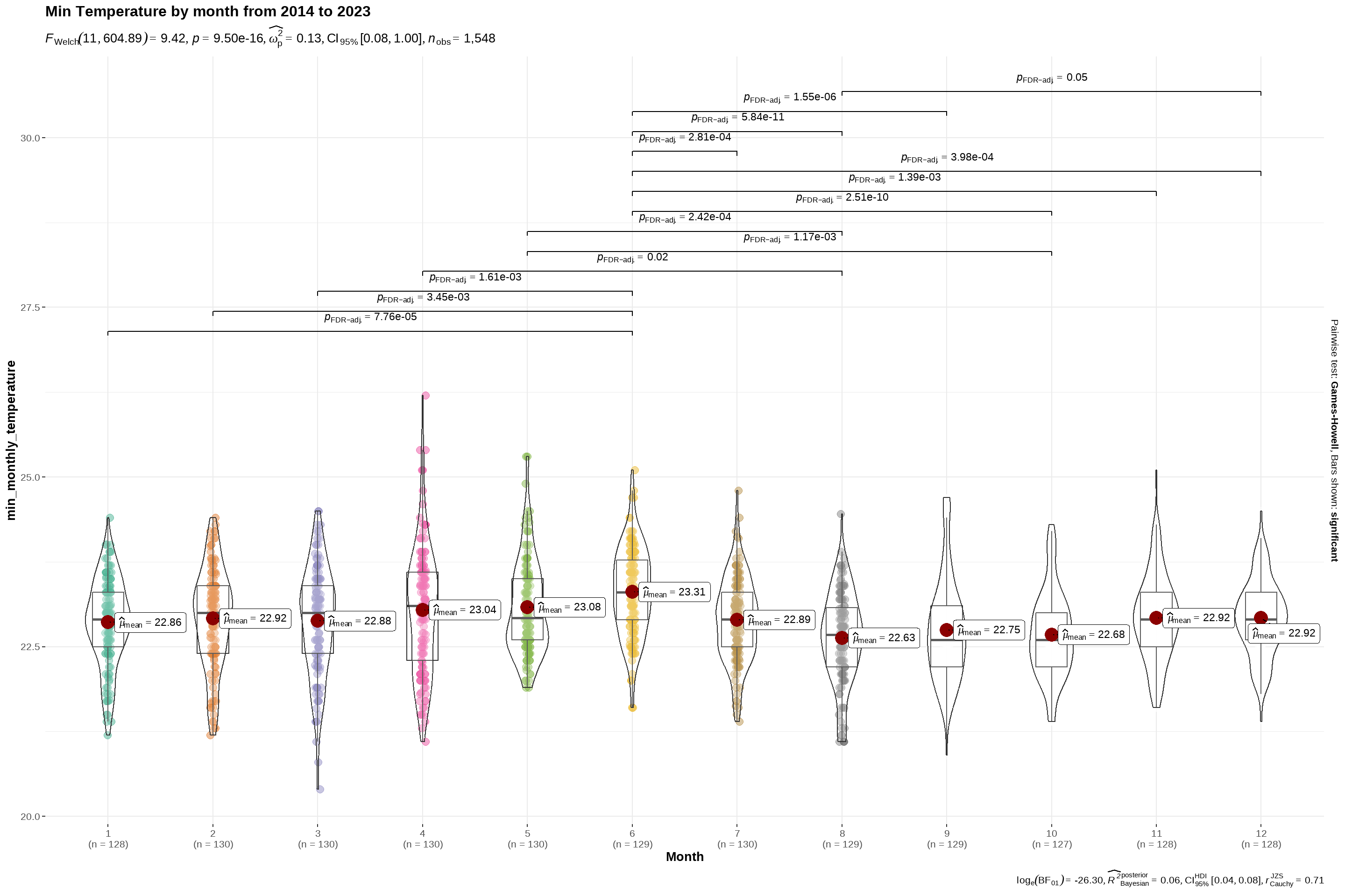
$ min_monthly_temperature <dbl> 21.70000, 22.40000, 21.80000, 23.50000, 22.40…
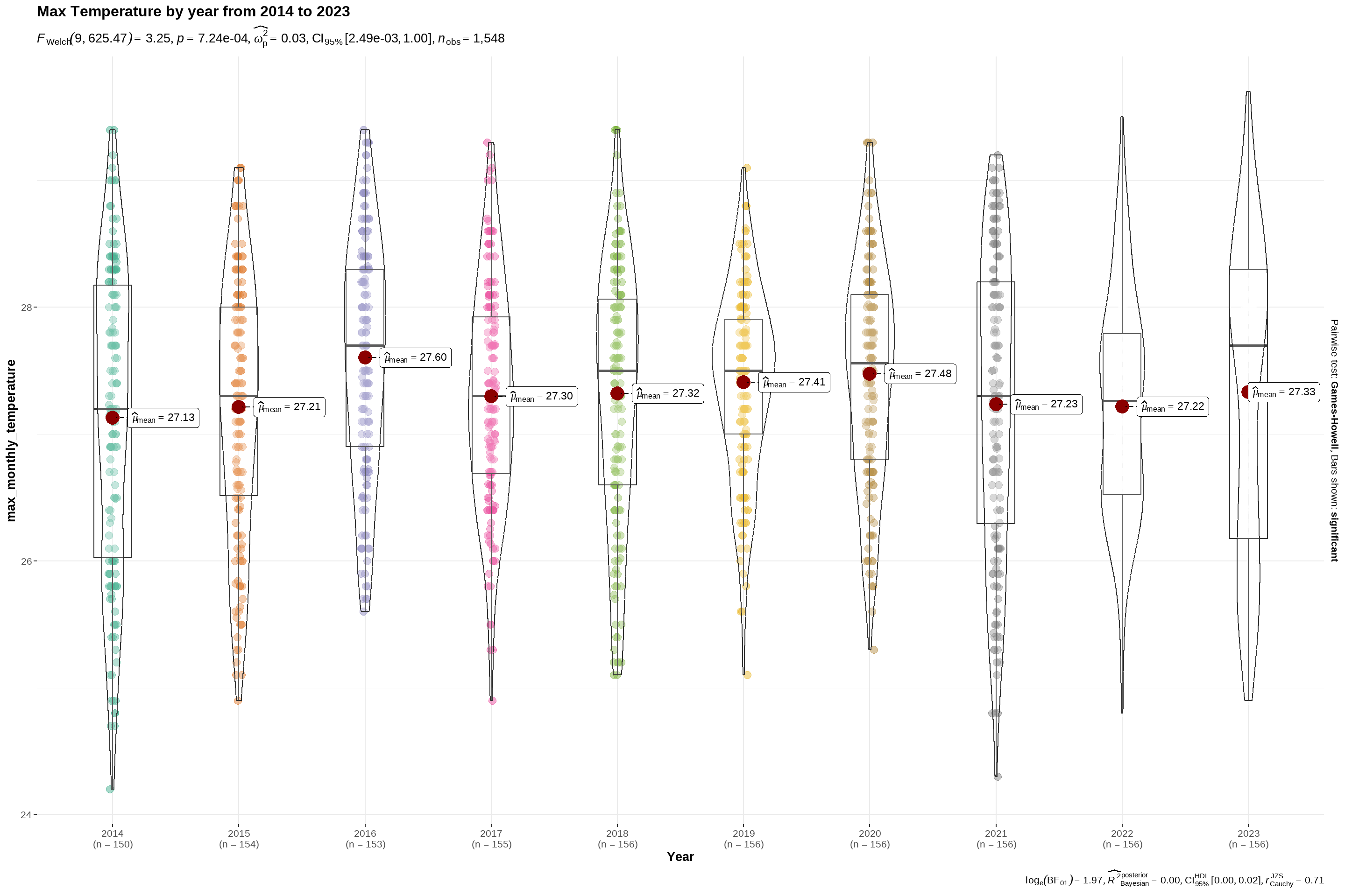
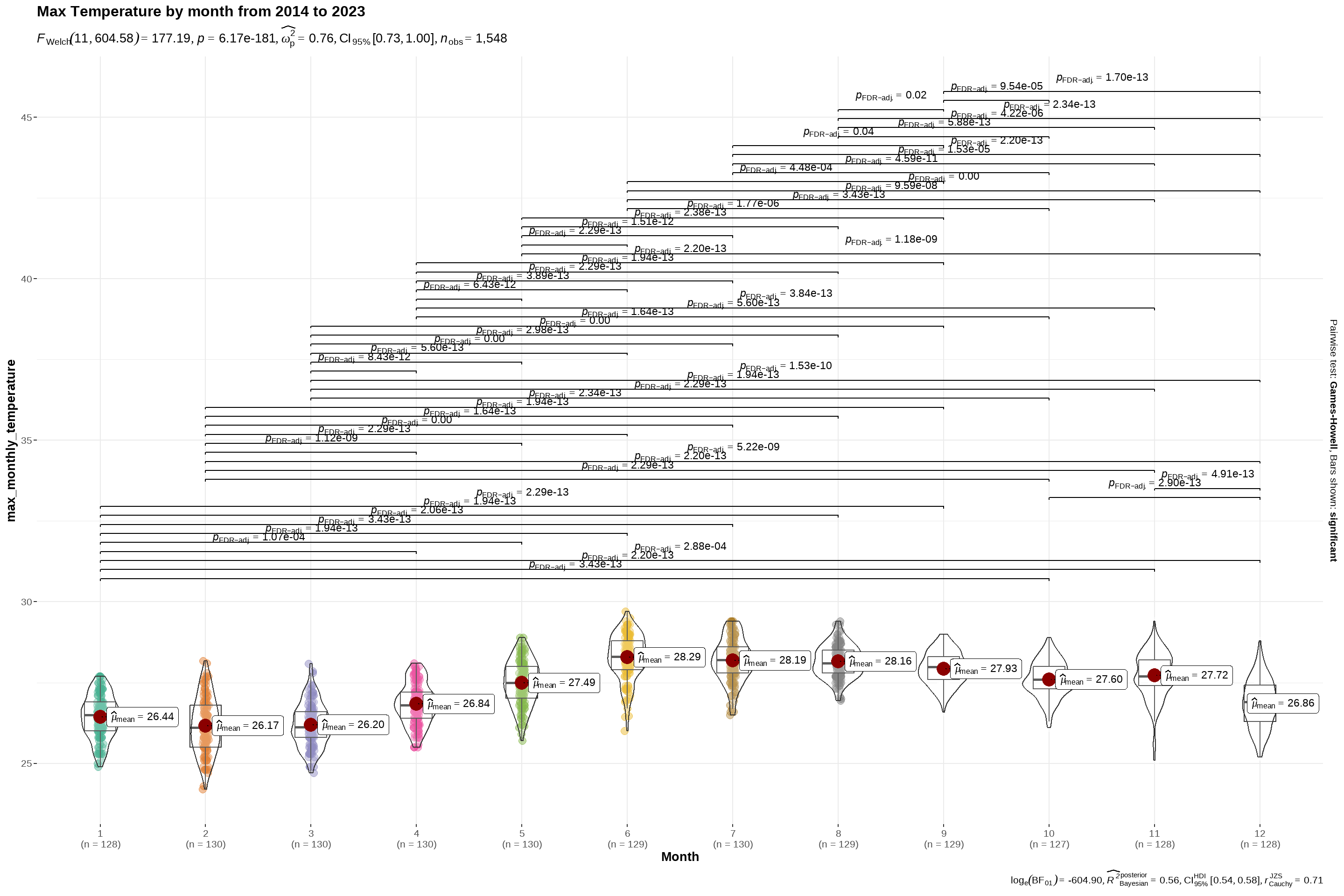
$ max_monthly_temperature <dbl> 25.30000, 24.90000, 24.90000, 25.80000, 26.50…
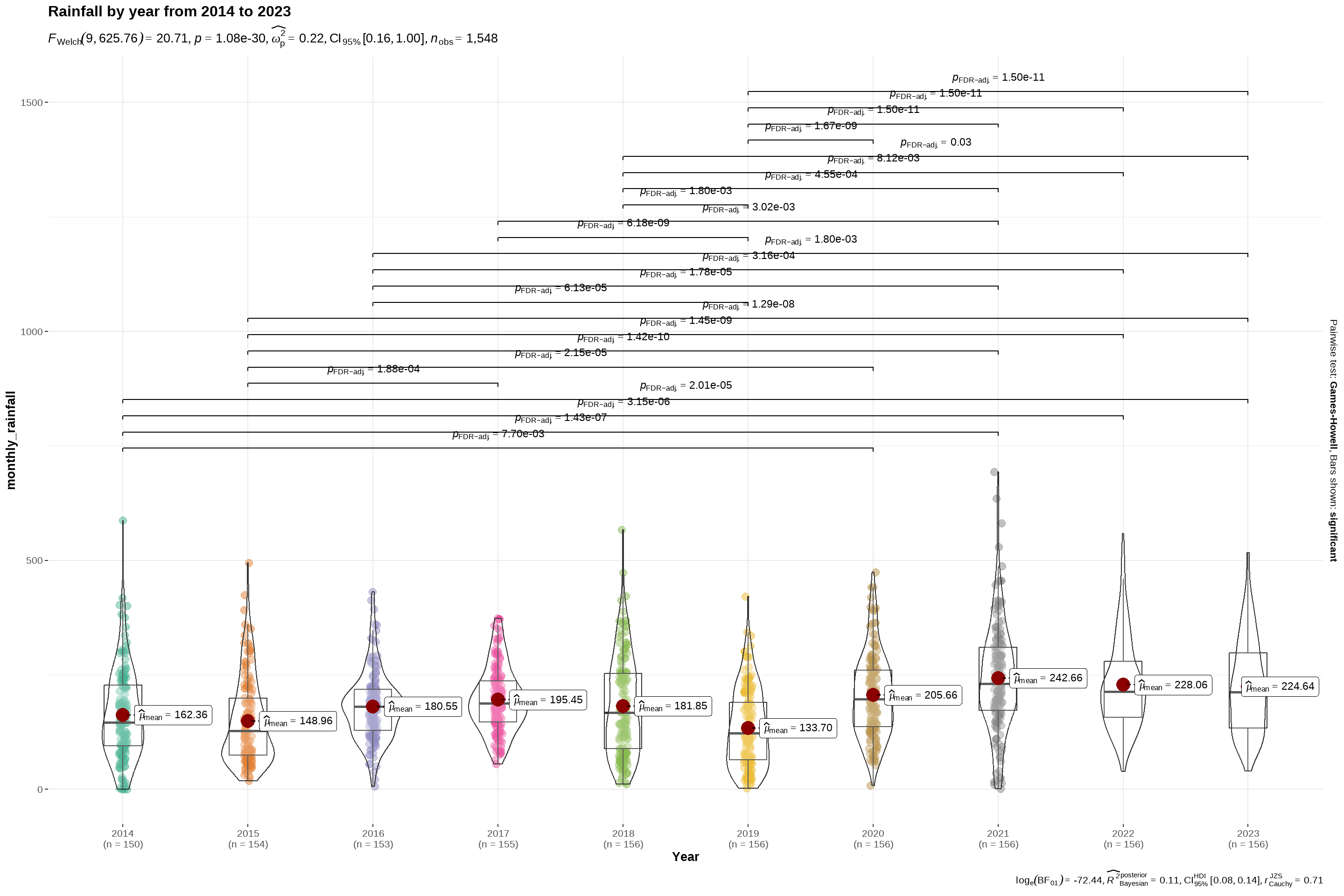
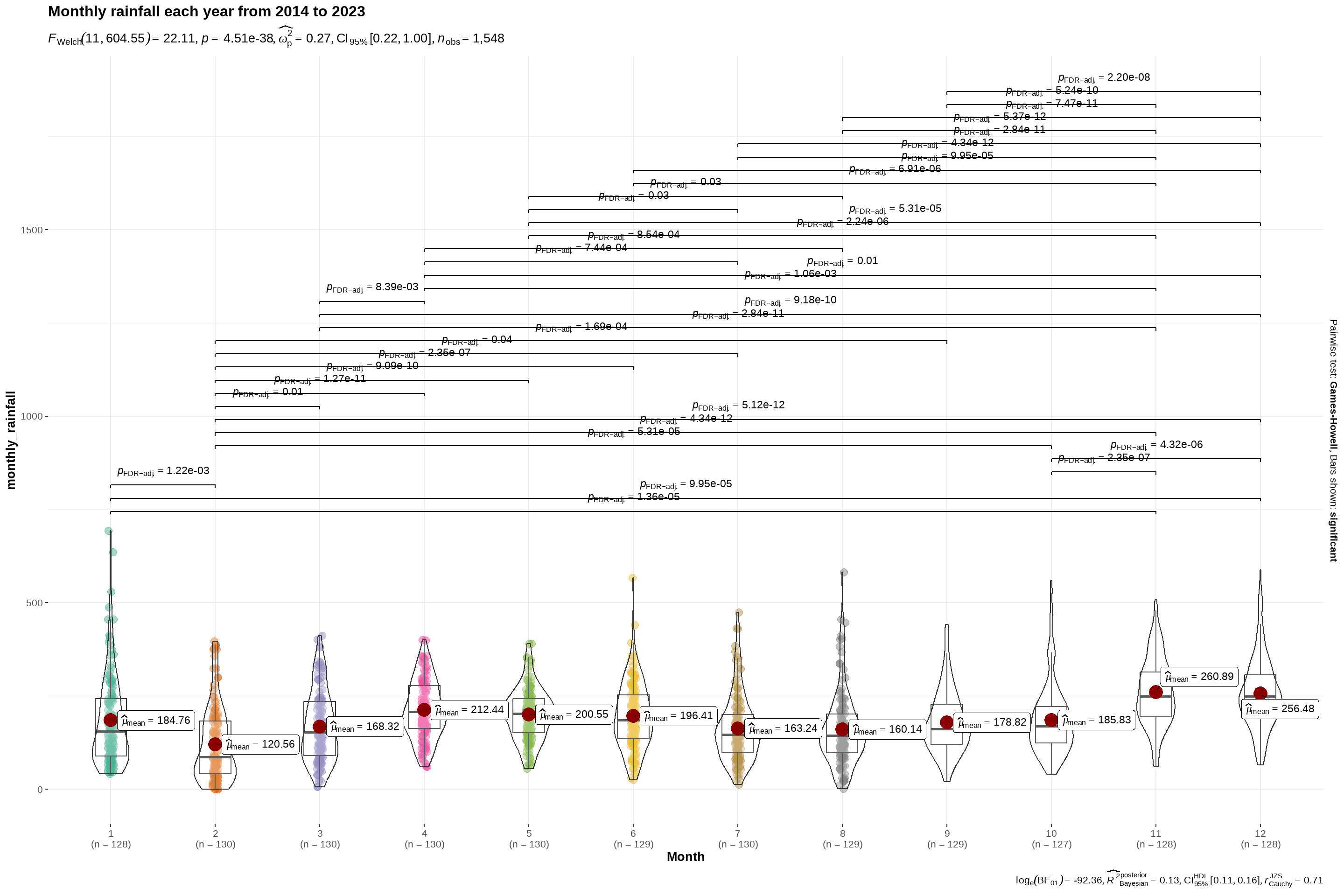
$ monthly_rainfall <dbl> 98.8000, 15.8000, 120.0000, 261.4000, 301.000…
$ Year <dbl> 2014, 2014, 2014, 2014, 2014, 2014, 2014, 201…
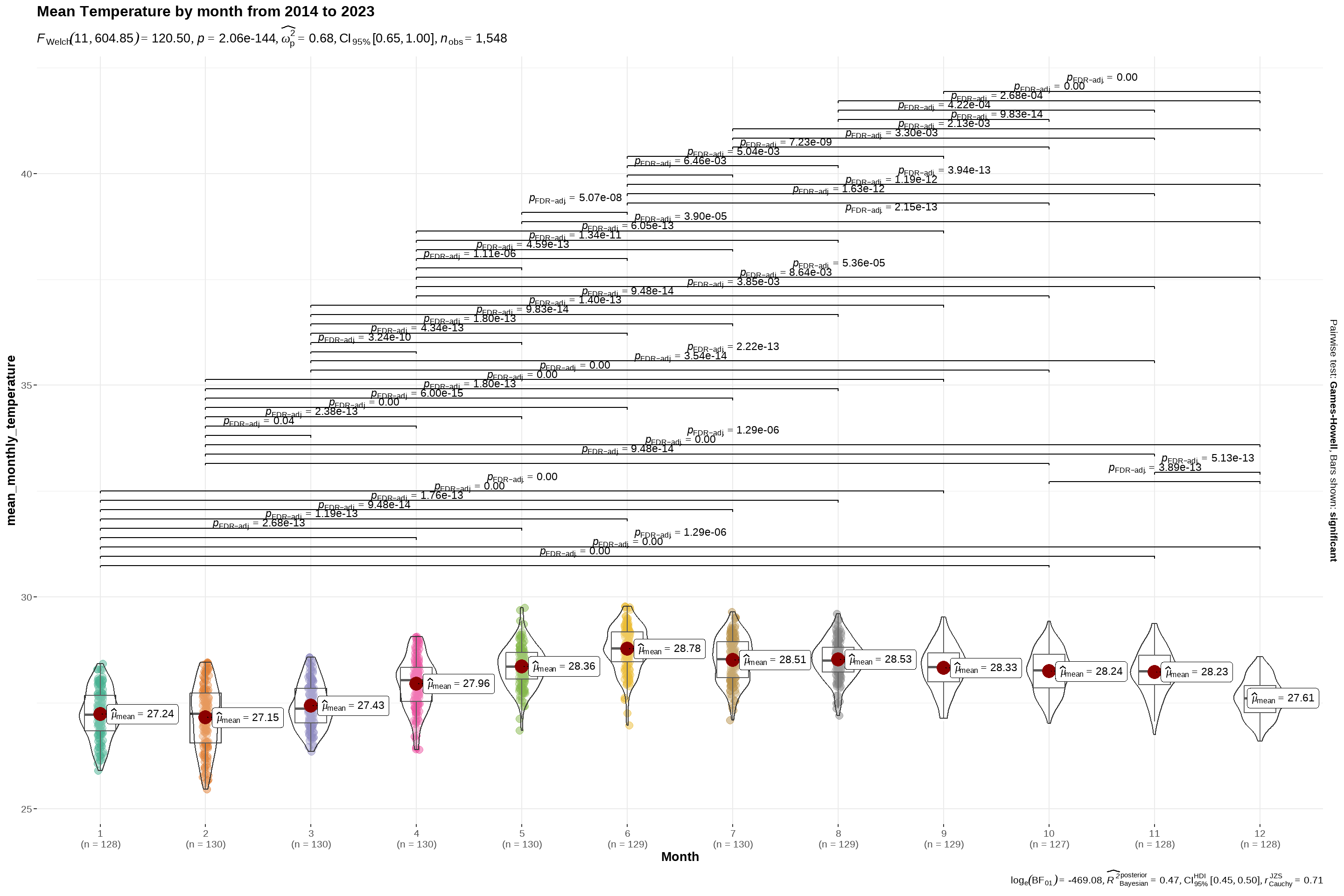
$ Month <dbl> 1, 2, 3, 4, 5, 6, 7, 8, 9, 11, 12, 1, 2, 3, 4…